It’s two years – and, at the same time, four centuries – in the making.
Its origins lie in a museum in Antwerp as well as the archives of the Smithsonian Institution.
And best of all, its design is wholly grounded in input from today’s newspaper editors, designers, and art directors from around the world.
“It” is a new offering of newspaper typefaces called “The Poynter Fonts: The Readability Series.” The project is the central focus of the Institute’s Typography Conference, 19-22 November 1996. Designed to optimize all aspects of text readability, the font series is the result of an ongoing collaboration among Poynter faculty, conference participants from newspapers large and small, and the Font Bureau of Boston.
Following is a Q&A about key issues regarding the project. For technical specifications of this typeface series, availability and licensing questions, contact the Font Bureau directly. For academic questions about Poynter’s work in the area of typography, e-mail Ron Reason at the Poynter Institute. Further questions submitted about the type project will be added to this document.
Why a new type series? Why now? And why Poynter?
Nearly half a century has passed since any major effort has been made to address the typographic needs of newspapers from the ground up. Papers have been adopting general purpose faces for lack of anything better. The Poynter Fonts have allowed the specific investigation into current newspaper needs, the technology and publication methods available today. The new series of fonts for print, now in the beta test phase, will be accompanied by a companion series for the web, currently in development.
Nelson Poynter, founder of the school that has become The Poynter Institute, was for many years the owner and editor of the St. Petersburg Times. There he was a champion of excellence in printing quality and technology, and the Times (one of the beta test sites of the new type project) is known around the world as a pioneer in these areas.
How does this project differ from the run of available typefaces?
Through its conferences and ongoing conversations, Poynter has questioned the industry closely: What are the most desirable characteristics in a current text series? Our questions revealed an immediate need for a series of closely spaced weights tuned to the various conventional processes, to be accompanied by versions tuned to screens and the web. We started development of the current fonts after the last Poynter Type Conference in May, 1995. Controlled print tests of the beta fonts have been conducted by participants at the ’95 conference, and others who will be attending our conference in St. Petersburg, Fla., 19-22 November 1996. Test newspapers will convene to engage in discussions and debate, and to offer information and criticism that will shape the final fonts.
So what’s “wrong” with Times, Century and the rest?
In choosing a model for the text face, we have been guided by the growing popularity of Times Roman, while recognizing that it is not wholly satisfactory for a number of reasons. We believe the appeal of Times comes from its grounding in the Dutch types of the 17th-century, with their classical combination of comfortable familiarity, economy and readability.
In recent years, newspaper and magazine art directors have been searching for original and more elegant alternatives, but have found that most obvious candidates – Garamond or Goudy Old Style – seem too spindly and bookish for their purposes.
Newspapers satisfied with their current style may have no cause to consider a change. This series is prepared for new publications, those considering or involved in a change, and those interested in a more stylish and effective dress.
Who is testing the new fonts?
A number of papers that are undergoing or considering redesigns are testing the fonts. A number of others that are simply interested in the state of typography are running it as a test on their presses, and offering the results for discussion at our conference. One of our goals is to see how the fonts will reproduce across the printing gamut, from the oldest letterpresses to the latest and the best technology. Test sites include major dailies – The Washington Post and St. Petersburg Times – to local papers such as the Kinston, N.C. Free Press. Newspapers from Germany, Canada and Switzerland will be among those attending the conference.
What distinguishes the fonts?
The serif design being tested for body text is available initially in four closely spaced weights. They have been created to provide a choice that suits particular printing conditions at the paper or, indeed, for different sections of the paper. Each character in all four weights is designed on the same width; changes can be made between weights without affecting the flow of the text. Designed as a multiple master font, custom weights can be developed if required.
The text fonts are accompanied by a sans serif boldface. Designed to complement the serifed text, it is suitable for sub-titles and highlighted names, dates or other elements within the text.
The text italic has yet to be designed, and will be a topic for discussion at the coming conference.
How would these fonts benefit my newspaper?
Readability depends above all on familiarity. Poynter provides a classical oldstyle roman, the central design in the American text library, carefully tuned for ultimate readability in the newspaper column.
A newspaper using offset presses, with perhaps greater ink spread, may find a lighter version of the font reproduces best, while a better-quality letterpress paper may choose a slightly heavier weight. Papers inking for ultimate quality in illustrations may want a different weight than papers favoring sharpness of type.
Newspapers using transitional or hybrid output methods should really benefit from use of these fonts. A paper that prints feature or advance pages directly to negatives might do so with one version of the font, while choosing a lighter version for news pages that go through paste-up (increasing dot gain and perhaps loss of quality). Text can be freely moved from section to section without affecting copyfit, since all weights are designed on a single set of character widths. Properly used, these fonts guarantee a consistent quality of text reproduction from front to back.
Where does the serifed text design originate?
Type designer Tobias Frere-Jones of the Font Bureau in Boston has used as a starting point the work of Hendrik van den Keere, the 16th-century originator of the large x-height Dutch romans that are the ancestors of Times Roman. Van den Keere’s practical proportions prefigure the requirements of newspaper text, finished with the elegance and high style that we associate with his French contemporaries Garamond and Granjon. His work survives as a series of steel punches in the Plantin-Moretus Museum in Antwerp. These images are now available to us through Mike Parker’s precise photographs, a design that has been waiting for the right conditions to serve as a model for a newspaper textface.
When will the Poynter Readability Series be available?
Following the upcoming Poynter conference, project coordinators will assess results of the print tests and participant opinion, and refine the finished romans. The italics will be designed, and the sans serif boldface will be completed. The finished series for conventional newspaper text is planned for release in summer 1997 from The Font Bureau. The same series tuned for the web will follow. A Poynter headline series is under consideration.
What about fonts for the web?
We plan to show at the Poynter Typography Conference trial versions of the text design, experimentally re-designed and engineered as high speed grey-scale type for the web. Currently, there are many limitations on the use of typography in web pages; Poynter web fonts anticipate the day when more widespread control of typographic elements in web pages will be available, allowing papers to synchronise the design of web pages with the appearance of the conventional paper.
What sort of headline series will be considered?
Development of a headline series is just now beginning, and will be a topic of discussion at the Poynter conference. Original drawings of Morris Benton, the type designer who created Lightline, News and Franklin Gothic, have just recently become available to us, thanks to the completion of a 25-year archiving and cataloguing effort at the Smithsonian Institution. These were the inspiration for the text boldface now in beta testing, and should provide a good grounding for a new sans serif headline series as well. (Stan Nelson, responsible for the typographic effort at the Smithsonian Institution, will be among the participants at the Poynter conference.)
Back to top of page
Thoughts from Nelson Poynter on newspaper technology, readability, and survival.
Q&A on an Exciting New Series of Typefaces for Newspapers
More News
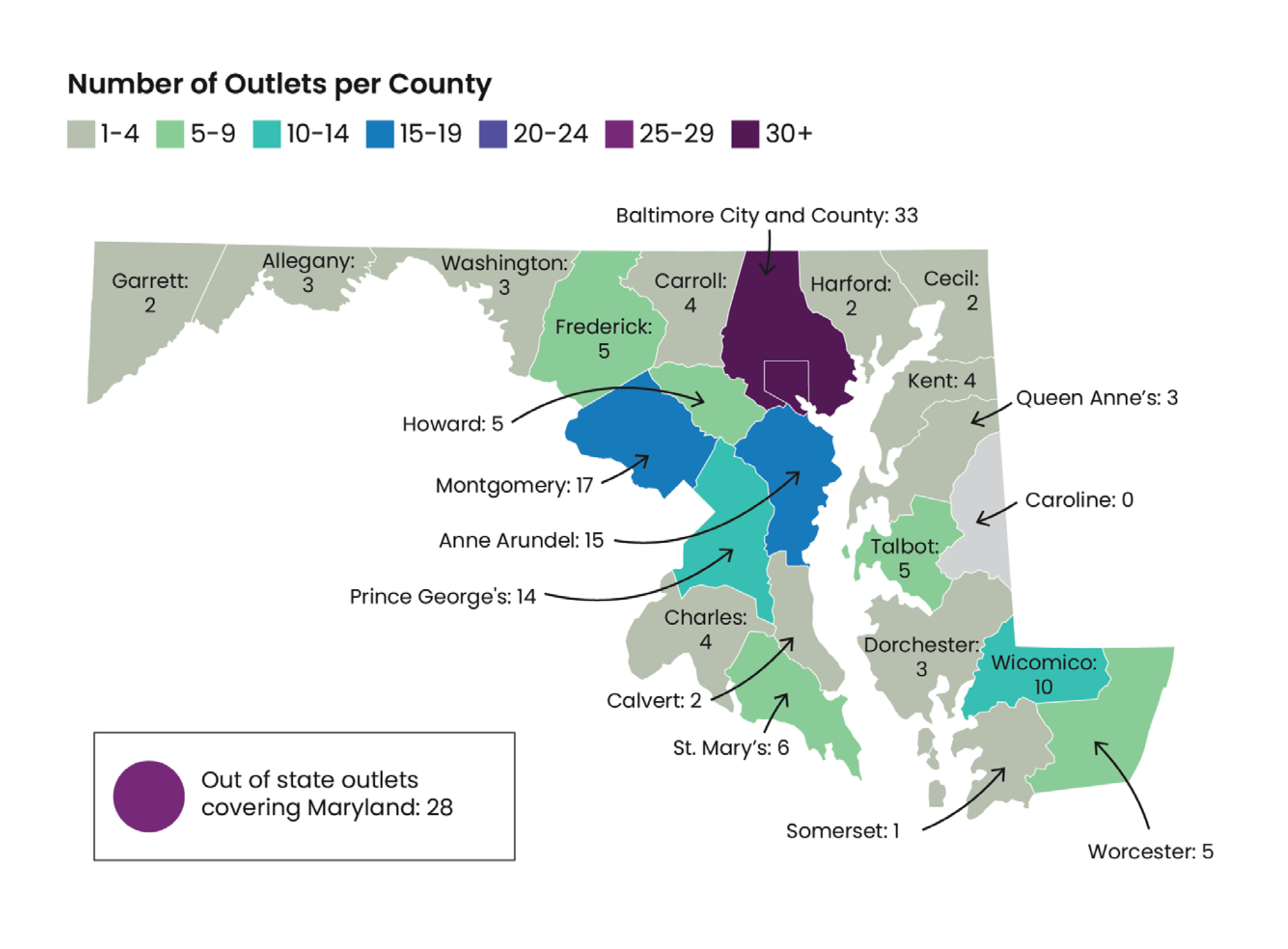
Topography of a news ecosystem: A first-of-its-kind study diagnoses the local news crisis in a single state
Media scholars at the University of Maryland documented the spread of local news dead spots — and unexpected vibrant areas — in that state.
April 19, 2024
$12 million Global Fact Check Fund opens applications for second year of grants
A partnership between Poynter’s International Fact-Checking Network and Google and YouTube continues to support fact-checking initiatives worldwide
April 19, 2024
Opinion | A columnist made a controversial introduction to Caitlin Clark
IndyStar sports columnist Gregg Doyel has been crushed online and accused of being creepy, sexist and worse. He’s since apologized multiple times
April 19, 2024
‘Satanic rituals’ at Taylor Swift shows? That’s false. And experts say the attack isn’t new.
Experts say musicians have been accused of performing satanic rituals for decades
April 19, 2024
How a longtime film critic’s death represents the great dissolve of local film criticism
Bryan VanCampen of The Ithaca Times was an institution in the central New York college town of 32,000. He might have been the last of his kind.
April 18, 2024


