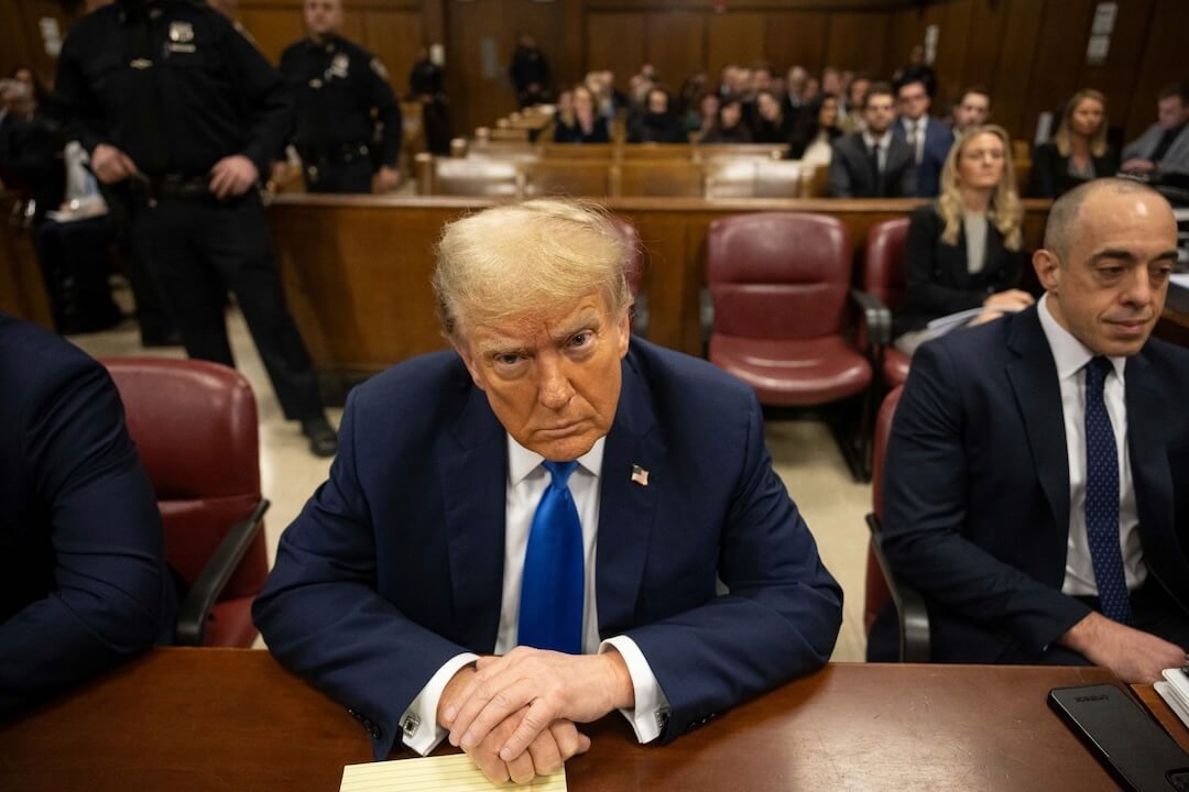
‘Tis the season to pull out the bunting, stars and stripes, ballot boxes, and red, white, and blue. The campaigns look ultra American, but does the news media need the same glitz and glam? Some would argue yes, that it’s a sign of the times.
The questions for me are: Are people conditioned to recognize election coverage by seeing these traditional, patriotic symbols? Are they necessary? Or, are they more decoration than information?
I say it’s the latter.
Most papers, websites, and TV stations have produced some kind of imagery that is decorative and not informative. For the most part, it gets in the way of the content by being distracting and filling space.
Many newsrooms are just programmed to believe “we need an election graphic/logo to go with all of our election coverage — that’s good branding.” A postage-stamp type logo is then used with every election story.
As a side note, I have to acknowledge that even on Poynter’s homepage the patriotic use of our convention coverage logo assumes that default position. And it’s an easy position to take when you are short on time.
It all comes back to planning. The presidential election comes every four years, yet like many places, we sometimes wait until the day before to come up with something for the page. It’s partly a cultural issue, but ultimately it lands in the design editor’s lap. And that would be me.
The Poynter EyeTrac study of newspapers conducted in 1990 showed that people are attracted to color and imagery first. So, it might be just as effective to put a red box whereever you want your reader to look, right? But does that help them navigate, understand, and digest the information effectively? Probably not. It may get them there, but there’s no added value.
Something as simple as a text label is an effective navigational device and provides instant recognition of the content.
So set Uncle Sam free and leave our beautiful flag on the pole. Instead, save your time and save your readers time by focusing on tight visual editing. The content of a single photo will have more impact than any decorative element.
Check out: The Dreary Art of Presidential Elections by Steven Heller