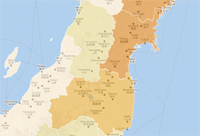
In recent weeks, the media have reported on how events in Libya and Japan are affecting Misurata, Az Zintan, Tripoli and Rikuzentakata.
Is your geography good enough to know that Misurata and Az Zintan are in northwest Libya, that Tripoli is northeast of Kabaw, and that Rikuzentakata is a coastal town in northeast Japan?
If not, then look at some of the maps that journalists at The Wall Street Journal, The New York Times and CNN have published recently in print and online.
-

- A chart showing the spike in searches for maps of Libya.
Stats from Google trends indicate that people want to know where the countries and cities in the news are located. Searches for maps of Libya and Japan, for instance, have spiked significantly this month.
Google’s Sean Carlson says he’s seen a steady flow of news organizations using Google Maps and Google Earth to help illustrate recent international stories. He looks at these tools as “helicopters in the hands of news organizations” — ways to provide readers with a perspective they might not otherwise get from text or photos.
So, what makes a map valuable? And why are they such an important form of explanatory journalism?
Location, location, location
At their most basic level, maps show people were a place is located. Creating locator maps for print is generally the first step in The New York Times’ map-making process, said Matthew Ericson, deputy graphics editor.
“We want to help readers understand the geographic components of a story,” Ericson said in a phone interview. “We develop the map from there and say, ‘How can we move it forward? What information is useful to a reader? What should we put on a map that would help readers better understand this?’ ”
The Times and other national papers have been regularly running maps of Libya and Japan in their print editions. Some readers may already be familiar with these cities and countries, but let’s be honest: Americans aren’t known for having the best sense of geography.
“Myriad polls and surveys leave no doubt that Americans are among the most geographically illiterate of all developed societies,” writes David Keeling, a professor of geography at Western Kentucky University. Furthermore, “the ranks of Americans who have ever taken a geography class in high school or university are small.”
News organizations can help fill this void — not just by letting people know where a place is, but by providing them with additional context that helps them make sense of the news and its geographical component.
Interactive maps do a good job of offering context. Take CNN’s map of Japan. Users can select different tabs to see how the earthquake has affected various parts of the country, and which cities have the highest number of casualties.
-

- Users can click on various icons to see videos, iReports and text related to cities on this interactive CNN map. “I think especially with the Web format, a map has so much potential to be a story by itself,” CNN World Editor Amy Cox said in a phone interview. (c) Google
Another good example is The Wall Street Journal’s interactive map of Libya. Each day the map is updated to reflect the latest news about air strikes and explosions in cities such as Misrata and Sirte. By clicking on the cities, you can see what’s happened there that day and compare it to days past. The New York Times, which has four cartographers, has also been updating its map of Libya daily.
Providing users with updated maps can give them reason to return to your site.
“The data-driven interactives take a lot of time and teamwork to produce, but they have the greatest value and generate good traffic and time-spent on the site,” said Juan Thomassie, senior interactive developer at USA Today. “I think maps are most valuable when they tell more than just where a place is. The location can be important, but the context is really most interesting.”
Showing changes over time and place
Any context that helps show users changes over time and place are valuable, says Wall Street Journal News Editor Kate Ortega. Interactive maps work best, she noted, when they involve multiple places and events, such as the stories out of Japan and Libya.
“If it’s a one-place or one-time event, for example, a mosque bombing in Baghdad or a series of bombings at the same mosque over a series of weeks, a locator map or a timeline could be useful, but there’s not much complexity that would make an interactive map very interesting,” she told me. “But if you can introduce another dimension, for example, mosque bombings over the course of six months or in multiple cities, now you’re talking.”
The Times has found that interactive maps showing changes over time and place help people understand the bigger picture.
-

- Users can turn to this New York Times map to see where buildings have been destroyed and how many people have died in each city.
“One of the maps we put up fairly soon after the tsunami hit in Japan showed damage from the earthquake and the tsunami. What people wanted to see was how widespread the damage was,” Ericson said. “There were lots of stories and photos, but to really get a sense of how far up and down the coast that damage spread, the interactive map gave you a good way to do that. It let people bring some geographic understanding to the photos. They could see the photos and where the towns were located and then see how the damage there compared.”
Interactive maps can also recreate a sense of time and place. Patrick Cain of Global News has created a couple of maps to explain historic events that “may have become invisible through the passage of time.”
A World War II map he created, for instance, shows a single day’s deaths in 1942.
“The map shows that a small neighborhood of a few streets near Queen and Spadina lost five people,” Cain told me. “The area has changed many times, and the people for whom that was a lived experience are mostly dead, but an interactive tool like this can reconstruct it, to an extent.”
Maps localize, personalize news
It’s not always easy to see how stories taking place in other parts of the country or world affect us. But maps can help us localize the news and relate to it.
“I think the power of being able to use maps is the chance for people to relate it to their own lives,” Rebecca Shapley told me by phone. Shapley is product manager of Google Fusion Tables, which some journalists are using to collect and organize data for maps.
“If you’re doing a story about earthquakes, you can say, ‘How many are near me?’ ” She noted that a lot of news organizations’ maps enable users to search information by ZIP code.
The Takeaway and CNN Money recently used Google maps to personalize the news about Japan’s nuclear reactors by showing readers how close they live to nuclear power plants in the U.S.
Maps “let people take a look and zoom in and see how where they live compares to other areas around the world,” the Times’ Ericson said. “There’s a sense that ‘I can explore and compare my neighborhood to the rest of the world,’ which I think is always a useful source for readers.”
Text and photos, of course, can also provide ways to relate to national and international news. But the power of maps is that they say so much in so few words.
“The visual display of information on a map can be such a rich experience,” said USA Today’s Thomassie. “Design and data come together with color and interactivity and they often tell a story that is so much more compelling than words can describe.”