On deadline, it’s hard to visualize some data that would inform your readers more than the paragraph or two you’re going to have to write out. Even at their peak, there were never enough graphics pros in newsrooms to just toss a chart into a story willy nilly.
There’s a growing selection of tools to fill the need, but most of them fall down in one or more places. They produce cool interactivity but cost money to embed; or they’re free as long as the post doesn’t get too much traffic, which creates perverse incentives; or the learning curve to build something is sky high and requires a professional, which is what we were trying to avoid in the first place.
Enter Chartbuilder, a free tool that makes it stupid easy to make a simple static chart of some basic data and get it into your publication. It really just involves copying, pasting, tweaking and exporting. The output is an image — no interactivity — but that’s an advantage, not a drawback. You want a chart in less than 10 minutes that requires no magic to get online? Here you go.
And, it’s open source. Don’t like something? You’re free to fork it and change it yourself. You can alter the styling to fit your publication’s look and feel. You can do whatever you want. Go wild.
If all you want to do is kick the tires, the father of Chartbuilder, David Yanofsky, pointed out on Twitter there’s a hosted version here. You can skip down to the Using Chartbuilder parts below where I’ve included some data for you to try out.
But if you want to change the style on your charts, or if you want your own version running locally, or if you just want to learn something about the command line while trying out a new tool, read on.
In terms of installing Chartbuilder, it’s pretty easy. My only beef with it — and it’s a minor quibble I’ll fix right now — is that the instructions assume you know your way around a computer like a developer does. If you’re not that person, the first steps to using Chartbuilder are a doozy.
The best thing to do is to give you an example and walk you through it.
Let’s play pretend.
You now live in Lincoln, Neb., where for nearly the entire month of July, we didn’t have a drop of rain. Last summer was one of the worst droughts on record. At that time, the city put watering restrictions into place that made it a misdemeanor crime to water on the wrong day. There was a lot of anger — and some funny moments — to go with it.
So the fear around town was that with so little rain, watering restrictions would return. The city put up the same signs from last year, warning that if people didn’t start using less water, rate hikes and mandatory restrictions were coming.
And then something remarkable happened: It started raining. A lot. And people stopped watering their lawns.
I can tell you all this, but you really don’t know how much a little rain makes a difference until you make a chart. So let’s use Chartbuilder to do just that.
How to set it up
Using a Mac or Linux? Good news, you’ve got what you need. Skip to the next part.
Using Windows? The bad news is you need to install Python. The good news is, it’s not that hard if you have administrative rights on your computer.
First, download and install Python 2.7. Get it here.
Next, after you’ve installed Python, you need to tell Windows that you’ve installed Python and that when you type ‘python’ on the command line, use Python. It all sounds strange, but to do this, you have to change something called an environment variable. Specifically, you need to add Python to your path.
To do that on Windows, it’s a little different for each version, so you might have to Google how to do it. On Windows 7, you’ll need to open a Control Panel, go to System and Security, then System, then click Advanced system settings.

In there, you’ll see a button for Environment Variables. Click it, and in the system variables area, scroll down to the Path line. Click it to highlight it, then click edit.

If you just installed Python to the default location, you can add this to the end of the variable value: ;C:\Python27

To see if this worked, open up a Command Prompt (click the start button, search for it or go to Accessories > Command Prompt). There, you should be able to type python and it should open up a python interpreter when you hit enter. If you get an error message saying python wasn’t a recognized command, it means Windows can’t find Python, so you should check the path environment variable again.

To get out of the python interpreter, hit control-z then hit enter.
Getting Chartbuilder
There are two ways to get Chartbuilder. If you know how to use Git, then you can clone the repository onto your computer and get started.
If you have no idea what Git is, no worries.
Go to Chartbuilder’s GitHub page. On the right side, you’ll see a button that says Download ZIP. Click that and a zip file of the project will be downloaded. Double click on the downloaded file and follow your operating system’s instructions on extracting the files. One critical thing to note: Remember WHERE you extracted it. You’ll need to know this soon. But if I were you, I’d put it somewhere easy to remember inside your home directory.
Starting Chartbuilder
Ever seen developers typing commands into their computers looking like they’re communicating directly with The Matrix? Time to get into that game.
On a Mac, it’s called Terminal. On Windows, it’s Command Prompt. Similar ideas, slightly different commands.
When you start the Terminal or Command Prompt, it defaults to your home directory. This is why I said put Chartbuilder there to make it easy. If you did do that, all you have to do is navigate into the directory. To do that, you type cd Chart and hit the tab key. If you don’t have anything else in your directory that starts with Chart, the tab key should autocomplete the path. Hit enter.
If that didn’t work, it means your Chartbuilder files are probably somewhere else. So you’re going to need to navigate there. Maybe you put it in the Downloads folder, which is a default on both Mac and Windows. No problem. To see what’s in a directory on a Mac, type Is and hit enter. On a windows, type dir and do the same. See the downloads folder? Good. When I told you to type cd before, that means “change directory” on both Windows and Mac. So if you left Chartbuilder in the Downloads folder, type cd Downloads and hit enter. Type dir or ls and hit enter. See Chartbuilder? Then cd into that directory.
Navigating directories takes a little getting used to, but once you learn to do it, you’ll be pretty quick at it. And there are a ton of tutorials online to help you if you’re struggling.
Now that you’re in your Chartbuilder directory, you’ve got one last thing to do: fire up a Web server that’ll run Chartbuilder. To do this, enter this command: python -m SimpleHTTPServer
In a few seconds you should see “Serving HTTP on 0.0.0.0 port 8000 …” pop up on your screen. If that happens, breathe easy because we’re done with the command line.
Using Chartbuilder
To use Chartbuilder, you do everything through a browser, interacting with software on your computer. So fire up a non-Internet Explorer browser (like Chrome, Firefox, etc.) and go to http://localhost:8000/
Localwhat? Localhost. When you typed that “python -m SimpleHTTPServer” business, what you did was start a web server on your computer. Localhost is a universal way of telling a browser “go to the web server on my computer”, where you will find that SimpleHTTPServer working on port 8000. Port what? Short version: Your computer communicates on ports. Port 8000 is an unused one so it won’t interfere with anything. Google if you want to know more.
If SimpleHTTPServer is working and serving files from inside your Chartbuilder directory, you should see Chartbuilder. Welcome. You should been greeted with a nonsensical chart about apples and oranges. Let’s get rid of that fast.
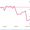
So, recall our water usage story. It so happens Lincoln Public Works posts daily usage amounts on their website, but they use some Google charting products to display it and I’m not a fan. For example, you can’t easily copy and paste the data out. I took the five minutes and just typed out the data in an Excel spreadsheet. Lazy and don’t want to do that? Here’s mine.
The Chartbuilder docs tell you that for time series data, the first column has to be the dates in your data and it has to be called “date”: you’ll see from my data that’s the case. Then there’s the amount used in millions of gallons per day, and the goal of 70 million gallons per day. To chart this, highlight the data in Excel, copy it and paste it into the data window in Chartbuilder.

Poof. Chart.
OK, so let’s refine this thing. It’s not rocket science.
Give it a title in the title area. We should label our right axis, so I use the right-axis suffix and added ” millions of gallons per day” (note the space before millions). Number of Y-axis ticks? I like six because it makes them even numbers. You can play with this, or specify your own there. Credit? Probably a good idea. Source? Definitely a good idea. With the dates we have, the X-axis ticks work kind of funky for some reason. You either get what you got with the default, or you get too many of them. No in-between. So leave it.
Change the colors? Why not. Click the box of color and pick one. I like usage with red and the goal in green; it offers a contrast.
At this point, you can play as long as you want. You aren’t hurting anything.
Like what you’ve got? Click “Create Image of Chart.” You’ll get two options. If you don’t know what an SVG file is, you want the image. It’s a .png file your blog or newsroom CMS can handle.
And that’s it. You’re done. Copy, paste, adjust, export. Easy.

And what does our chart say? It shows you that a little bit of rain goes a long way. After a very wet June, usage went up up up as it got hot and dry. Rains on July 21 and 28 sent usage off a cliff, and now we’re a long ways from the threat of higher rates and mandatory restrictions.
As I was writing this tutorial, my local paper wrote this story.
Too bad it didn’t have a chart.