To be honest, I hate politics — especially on a national level. But local politics is different. There are no Sunday talk shows, press people to hide behind, or escaping your neighbors over the decisions you make. And it’s much easier to see who’s invested in local politics through campaign donations, because there’s so much less data to deal with than on a national level.
In truly small towns, you can cover campaign finance with your eyes and a little experience. I used to cover a town of 3,000 people in Pasco County, Fla., and after a year on the beat I could recognize the names of local movers and shakers on the campaign-finance list — when there was one. In a town that small, you can self-finance a campaign pretty easily and win, and that’s what most politicians did.
But now I live in Lincoln, Neb., a “town” of about 280,000. A bigger city means more need for cash to buy radio ads (no really, they were everywhere), more yard signs, and more retail politics. But while there’s more campaign-finance activity, the amount still isn’t huge. In this spring’s local election there were six candidates for three spots, and the total campaign contributions from both individuals and political action committees consisted of 311 donations.
Could you eyeball that? Maybe if you’d lived here for years, but you still might miss something. So can we look at local campaign finance in a way that shows us who’s backing who and how they’re doing it?
Enter the network graph. Network graphs are maps of connections — a really simple idea backed by some really intense math. Fortunately, what we want to do will let us use the simple part and ignore the intense part.
Data journalists and investigative reporters have been interested in social network analysis (as it was called before social networking became synonymous with Facebook and Twitter) for years. But lately, new tools have made it possible to create simple network graphs with little effort and no expense.
And campaign finance is an easy network to grasp for our example, because it goes in one direction: I, the donor, give you, the candidate, money. Thus the connection.
There are a number of tools available to do this, but the two I’ll show you are NodeXL, a free add-on to Excel for Windows (sorry Mac folks), and Google Fusion Tables.
First things first
To do any of this, you’ll need some data. The more data journalism I do in my home state, the more I realize how poor the means of transparency are here. The Nebraska Accountability and Disclosure Commission handles all local and state political data, but there’s no way to download that data: you have to copy and paste data from the Commission’s website and do a whole lot of cleaning. Every state is different — some are better, some are worse — so it’s impossible for me to tell you how to get your own data.
Once you’ve got it, you’ll need a simple spreadsheet with three fields: The candidate who got the donation, the person who gave it, and the amount. Obviously, you’ll want those donors to be normalized — in other words, if a single person made multiple donations, make sure their name is the same each time.
How you clean up your data is more art than science — and half the battle of data journalism.
Using NodeXL
You can get NodeXL here. It’s a pretty simple download and install. Unfortunately, it’s Windows only — I run a Windows virtual machine on my Mac specifically for this kind of thing.
To use NodeXL, open up an Excel template they’ve created that will draw the graph in a window next to your spreadsheet. You find it in your start menu, under NodeXL. Once the spreadsheet template opens, you’ll see fields for Vertex 1 and Vertex 2, among other things. Those are the connections. So, with my data from Lincoln, I copied the candidate and donor fields and pasted them into the Vertex 1 and Vertex 2 field. Then I hit Show Graph.

With that, you get what’s known in the business as the hairball — or, in NodeXL, the Fruchterman-Reingold graph. It’s the default, and if you panicked when you saw it, stop. Because it gets better.
But let’s pause here for a minute. If we take just a bit of time and look, we can already see some things going on. For instance, look at the cluster of dots in the middle. If you click on one of those dots, you’ll see those are the better-financed candidates with lots of donations. Clicking on a node shows you all of that node’s connections and highlights that data in your spreadsheet.

Still, the appeal of the hairball in our example is pretty limited — there’s not a lot to see from it, honestly. So let’s see what else we can do.
If you click the Fruchterman-Reingold box, you’ll see you can choose all kinds of different graphs, depending on your data. They’re fun to experiment with, but the truly useful one for our case is the Harel-Koren Fast Multiscale graph. Click it, and then click Refresh Graph.

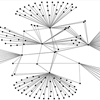
Whoa. Much different — looks like fireworks now. It won’t surprise you that those nodes with lots of lines and dots coming off them are the candidates. But what are these stray dots in this layer between the dot clouds and the candidates? And who are the dots in the middle?
Here’s where it gets interesting.
The dots in the middle are donors common to all or most of the candidates. Most are big PACs in town, such as the realtors, a big law firm and a major education-finance company headquartered here (which, full disclosure, employs my sister-in-law). The donors appear to back a lot of horses in the race to cover their bets, but most pick and choose — which is interesting in its own right. Why did the law firm give to everyone? Why did the realtors pick three Republicans and a Democrat? Why did the education company split two and two?
Don’t make the mistake of thinking the layout of the graph is random — there’s a partisan bent to it. But without knowing anything about Lincoln politics, how would you know that? In our template, you can style everything individually. So each node — or in NodeXL’s language, a vertex — can be colored. So can the connections. And everything’s size can be changed too.
So, to reveal the partisan pattern, click on the tab that says Verticies, which is a list of all the dots in our graph. You can color and scale each individual vertex. So, by scrolling down, I found each Candidate vertex and made it a size 10 dot. Then, I made the Republican candidate’s red and the Democrats blue, and hit Refresh Graph.

Note that every time you hit Refresh Graph, NodeXL redraws it completely, giving it a slightly different look each time. It’s mostly cosmetic — the fundamental truth remains. Like groups and connections stay together, and common connections stay in the center.
But now with our candidates standing out, you see the partisan divide in town. The only nodes in the middle are the (ahem) most-generous PACs.
But notice something else interesting — donor sharing.
On the Republican side, there are four donors who gave to all three Republican candidates. Two are PACs, while two are individuals. So who are these donors? Do they do this all the time? And what do they want for their money?
You can see that other donors gave to two candidates, but not to the third. Why? It’s interesting because some of those shared donors are big names in state politics. What does that say about who they’re backing? Or not backing?
Notice something else: Two individual donors crossed party lines. Get them on the phone.
One more thing: Notice how few shared donors there are on the Democrats’ side? No donor gave to all three Democratic candidates. That makes me wonder about Democratic unity at a local level — even local unions didn’t back all the Democrats in the race. And given that only one Democrat won and the partisan balance of the council shifted, that lack of local unity appears to have had consequences.
That’s a lot of questions to emerge from just one graph. And most of this analysis follows a pattern: look, click, ask why.
From NodeXL, your export abilities are pretty limited. You can dump out an image file, which means your post-production options are scant. And forget interactivity without performing a major overhaul.
Fortunately, if you want the product of your work to be interactive, there’s a pretty good option.
Using Google Fusion Tables
If you’ve never used Fusion Tables, it’s a Google product that has a ton of visualization options and, best of all, is embeddable. Pros: It’s free and easy to use. Cons: Your options for styling are limited. And it’s a wee cranky about formats.
To use it, you’ll need a free Google Drive account (the former Google Docs). Log in, and if you’ve never used Fusion Tables or haven’t in a long time, you’ll need to install Fusion Tables (it’s not a default any more). To do that, click Create > Connect more apps.

Find Fusion Table and connect it. When it’s done, click Create and then Fusion Table.
We can reuse our same spreadsheet. So with the Import New Table screen that comes up, click the Choose File button, find your spreadsheet, click Open, then click the Next button. Or, if you did your data clean-up in Google Spreadsheets, click Google Spreadsheets, find your spreadsheet, and click Select.
The next screen you’ll see is how the data will look when you import it. In most cases, the defaults are fine. Click Next. Here’s where you can add some metadata. If you’re going to publish this data, it’s a good idea to give it a table name that will work as a headline, add the attribution and a link if possible, and make your description like the explanatory text on a print graphic. When you’ve done that, click Finish and you’ll get something that looks like a simple spreadsheet.
To visualize this, you’ll need to add a chart. Click the red plus sign next to the Cards 1 tab and go down to Add Chart.

In Charts, you’ll want the last graph on the left side. It’s the network graph. If your data is like mine, and is ordered by Candidate, Donor, and Amount, you’ll see something like this:

Eeek. Not ideal. But we can clean it up a bit.
To do this, we’ll need to invert the “Show link between” part of our configuration. We want it to say Donor then Candidate, instead of Candidate then Donor. So, to do that, we’ll have to change Candidate to Amount, then change Donor to Candidate, then change Amount to Donor.
But, notice it’s kept the number of nodes at whatever unique number of amounts we had before. You can change that by editing that window above the graph to whatever the maximum number of nodes is (in my case, it’s 196). Once we’ve done that, check the “Link is directional” box and the “Color by columns” box. It defaults to weighting items by amount, so our nodes are sized by what amounts are attached to them. With that, you can see some candidates had more money than others, and some donors are bringing in more cash than others.
Unfortunately, that’s about it for configuration options — what you see is what you get. But the huge bonus here is that you can embed this and people can click around on it on their own. To do this, first click Share in the top right corner. See where it says Private? Click Change next to it and set it to Public. Then click Done.

Next, click the down arrow next to Chart 1 on the tabs. Go down to Publish and click that.

Here’s where you get your embed options. You can set a width and height — ask your web folks what the width of your story pages are. Click “Include data attribution” and then copy and paste the HTML into your page.
Here’s mine.
One interesting thing to do with this: reduce the number of nodes visible. When you get to the 20s, you’ll see the biggest donors. There’s no science to this, so be careful you’re not missing something.
As you can see, network graphs are a great reporting tool for local politics. In a matter of minutes, you can ask a lot of questions about how your local races are being funded and by who — better questions that will lead to better stories.


