Fifty milliseconds. That’s how quickly visitors can form strong, long-lasting impressions about your news or information website. But they aren’t sizing up the quality of your content or the sophistication of your code. They’re making nearly instantaneous, mostly subconscious judgments about how your work has been designed.
Those assessments can lead to very conscious — and consequential — conclusions about the merits of your page, product or platform. Bad graphic design can damage perceptions about your credibility. It can make your content harder to understand and render your work less appealing.
The visual Web
The Web is a visual medium. It didn’t start that way, back when HTML truly was all about marking up text. Over the years, though, the options for shaping the appearance of a Web page have grown more plentiful and sophisticated.
Now, of course, Web producers have a wide range of design tools at their disposal. Color, typography, imagery, positioning and many more design elements can be tuned to exacting detail. Emerging technologies like CSS3 and HTML5 make it easy to implement these visual ideas.
In the right hands, an array of design choices can produce impressive results. Misapplied, they can create a visual cacophony.
Thinking about design
To create a strong visual expression of your work, nothing beats working with a top-notch designer. Sometimes, though, you need to figure things out on your own, whether you’re bootstrapping your business or freelancing a multimedia story.
And, it’s always helpful to know the language digital artisans use to think about their craft, whether it’s floats and functions or points and pixels.
Good design skills may seem innate, even mystical. But the best designers are well-versed in a core set of widely-applicable principles. They’ve internalized the techniques prescribed by these ideas, applying them methodically and appropriately.
Fortunately for the rest of us, good Web design builds on the same principles that underly design in general. These are tenets you can study and apply. Many are rooted in psychology and perception — the way we attach meaning to color, search for patterns, crave balance, identify outliers and make sense of the world.
Three principles of Web design
Graphic design isn’t about making something “look pretty” but rather more easily understood. Good design is about communication. On news sites, it’s about helping readers identify the newest content, differentiate blogs from news reports, and spot the biggest story of the day. It’s about helping readers scan through lots of content to find the most important stories and the items that interest them most.
With these goals in mind, here are three principles of Web design that should guide your efforts:
1. Favor the simple over the complex. Whether you call it minimalist or simply a clean design, striving for simplicity is one of the best ways to ensure good results. A simple design is easier to implement, and it’s easier to interpret.
Simplicity is about limiting your options. Instead of using colors haphazardly, pick a scheme of just a few colors that work well together, and stick to them. Instead of five font families, pick two. In designing any particular element, start with the most basic implementation and see if it’s enough. Work from there.
2. Be consistent. Let’s say you come up with a certain design treatment for the headlines on your site that utilizes a particular font, color, size. Use that approach consistently across your product, only varying it with specific intent. Consistency is especially important from page to page or screen to screen. Make sure the design conventions you establish carry through your work. If your home page uses one color scheme, section landing pages should too, unless you’re specifically looking to brand those areas with color.
3. Express your voice. Every design choice you make tells your readers something about your product, your company, yourself.
Seven ways to design better Web content
Let’s take a look at some tactics we can use to develop a good design with the principles above as a foundation.
1. Use a grid. In Web design, a grid is an invisible set of equal-width columns along which the elements of a page are aligned. The gutters, or spaces between the columns, are also equal. Most grids utilize 12, 16 or 24 columns, and this transparent skeleton provides structure and alignment for a design. Grids appear in print design, too, and they’re a great way to help guide viewers as they scan through the contents of a page, whether it’s in print or on the screen. By designing content that spans multiple columns, designers can exercise lots of flexibility within seemingly rigid constraints.
Technology site The Verge adheres to a grid in its layout. The main structure rests along a three-column design, though certain elements break out of that mold. The use of a grid is evident from the way content lines up. In this example, the “Chromebook pixel review” headline lines up perfectly under the “Google on a non-profit budget” headline above it.

The Verge aligns its content to grid.
2. Repeat elements. Developing a design element — and then repeating it — is a great way to establish continuity and organization.
On a news site, repetition can be used to group similar kinds of content. The Christian Science Monitor, for example, uses different treatments for blog and news story entries on its homepage. Blog entries get smaller thumbnails and kickers. News items get bigger headlines and leads. The treatment for a given kind of content, though, is repeated every time it appears.

- The Christian Science Monitor repeats many design elements, including the entries in these blog and news story lists.
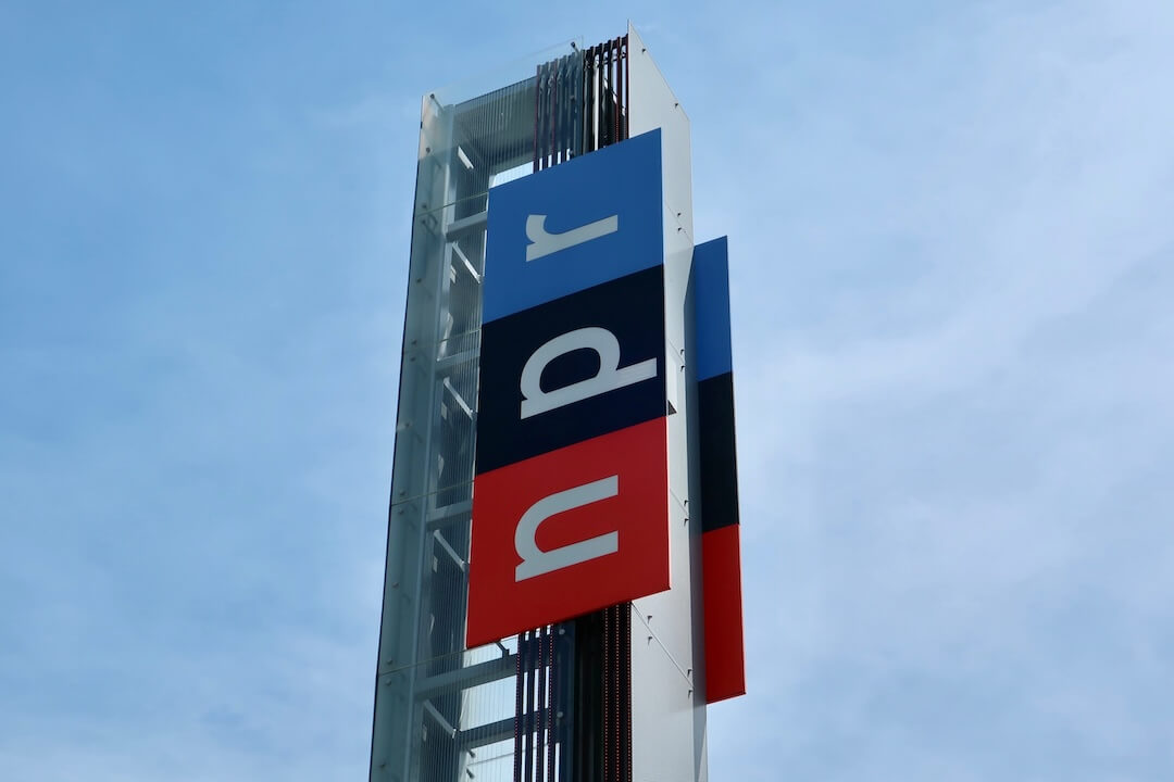
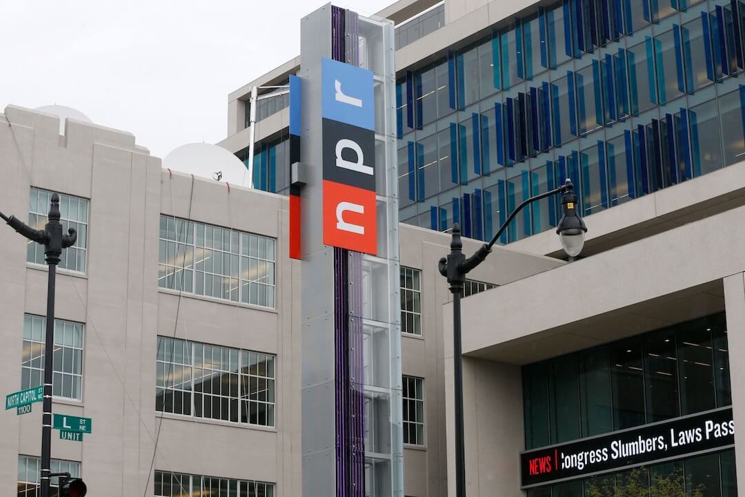
3. Use white space. Sometimes, leaving space in a design is just as important as filling it with something. This white space helps establish the relationship between elements, directing viewers’ attention. Generous use of white space — elements of a design that aren’t, well, designed — is one of the best ways to pursue simplicity. NPR makes extensive use of white space in their design, especially around key elements like headlines. All this room helps direct visitors to the most important content on the page.
4. Establish a hierarchy. By varying the size, color and positioning of elements, designers can establish a hierarchy for a section or page. This helps readers prioritize what they’re seeing, providing a kind of roadmap they can use to skim content.
The Boston Globe makes extensive use of hierarchy to establish importance. In this example, the first story on this homepage list gets priority not just with its position, but with a larger headline font.

- The Boston Globe gives prominence to its most important “latest news entry” by enlarging its headline.
5. Use texture and depth. These are ways to make a design more interesting. They often help reinforce a voice or brand.
In Web design, texture most often appears in the background, for example, behind the content in a footer or header section. It involves variation in the colors or shades of color used and can create the impression that something is polished, rustic, crumpled, etc. Depth creates the illusion that some elements on a page are stacked above or below others. It can be created with drop shadows and by varying the opacity of elements.
The Las Vegas Sun creates a subtle textured effect in their footer with the graphic of a sun. As part of their logo, this effect adds visual interest to the footer and reinforces the Sun’s brand.
6. Convey meaning with color. To maximize usability, color shouldn’t be used as the sole means to communicate meaning, but it’s an effective reinforcement. Adapting a tradition from its print edition, USA Today makes extensive use of color to “tag” its content: blue for news, purple for entertainment, gray for opinion and so on.
In this headline grid, color appears behind the tag and fills the squares when they’re hovered over.

- USA Today reinforces there content categories with color. Blue, for example, always means “news.”
7. Establish importance with contrast. Establishing a pattern — then breaking it with something that stands out — draws visitors’ attention to a certain element on a page. Contrast can be created any many ways – through color, typography, size, shape and more. The Schenectady, NY-based Daily Gazette uses red in its otherwise blue-toned color scheme to punctuate timestamps on its most recently published stories.
Form and Function
Web design is a rich topic, and I’ve only scratched the surface here. You might go deeper with self-directed training from Poynter’s NewsU on specific topics like typography, user interface design and color in news design.
Just remember: At its best, Web design isn’t about putting a “skin” on a finished concept. “Form and function should be one, joined in a spiritual union,” Frank Lloyd Wright said. In terms of creating on the Web, design should be considered alongside content, even developed in tandem with it.
And, for news sites and apps, design serves a special purpose: We know many consumers like to skim, and well-designed content is one of the best ways to make content scanning easy.


Comments