You’ve probably heard rumors of “the death of the homepage,” but The Guardian isn’t having it.
During a demo of the newly redesigned U.S. website in New York this week, Wolfgang Blau, The Guardian’s director of digital strategy, said the homepage was The Guardian’s “single strongest lever to direct attention.” He and other digital leaders at The Guardian surprised me by focusing so much on the homepage when talking about the new site, which went live today.
The homepage consists of new responsive “containers” of content. Anyone who has edited a newspaper site’s homepage with a CMS constraining presentation to one or two above-the-fold templates will be jealous of The Guardian’s seemingly infinite array of options for arranging content in a four-column grid. Stories can go as wide as necessary — with an image or without! — and can include various combinations of headlines, kickers, and byline photos.
The result: a modular design that translates well to mobile but doesn’t resort to the sameness plaguing other news site redesigns.
(Erin Kissane takes a closer look at the backend at Source.)

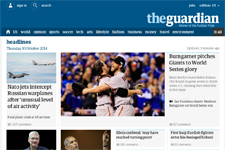
The previous Guardian homepage, top, and the new one, bottom.
More choices for how content is presented throughout the day offers more opportunities to exercise editorial judgment, and that’s where The Guardian thinks it has a competitive advantage. “People go to edited sources because they trust to be told what really is important,” said Alex Breuer, The Guardian’s creative director. Throughout the day, some stories get louder and others get quieter; now, the homepage reflects those nuances, Breuer said.
“We want to be world’s most influential news organization,” Blau said. That means continuing to grow in the U.S. (it topped The New York Times in unique visitors in September). American readers don’t know and trust the brand thanks to a print newspaper like UK readers do, said Cecilia Dobbs, VP of product for the U.S., so a redesign of its online presence is even more important in the U.S. (The beta site was rolled out to 5 percent of U.S. users earlier this year, allowing The Guardian to gather feedback, and the new design will go live for other Guardian sites soon.)
When the Guardian looked at its competitors, Blau said, it saw homepages that generally become repetitive farther down the page. The various ways homepage editors can arrange stories now — along with a new color scheme — gives readers visual cues that are especially useful given The Guardian’s mix of quick-hit news updates and in-depth features across many different subject areas, Dobbs said.
Globally, 31 percent of sessions at The Guardian’s sites include a trip to the homepage, and direct visitors to news sites are generally much more loyal, according to Pew. Still, the fact that 59 percent of visits to the site originated on article pages in September makes the homepage emphasis a fascinating choice. Will new U.S. readers — likely acquired through social media — decide to explore the homepage? It’ll be interesting to see if The Guardian does more to direct these visitors to the homepage to get a comprehensive view of what else the site has to offer.
Despite the way newspaper sites are often derided for looking too much like newspapers, I noticed that elements of the site’s design felt newspaper-like. Blau said the careful crafting that goes into a well-designed newspaper or magazine is often missing online. The Guardian’s new grid — guides that provide a rhythm and structure without sacrificing flexibility — make The Guardian’s new site more of a pleasure to browse.
Article pages revamped too
Of course, The Guardian recognizes that more and more readers are entering the site through article pages (and about half are arriving via mobile, where social media is even more important), so articles pages are better now, too, with more prominent social sharing buttons. Stories are wider and contain more white space. Article pages — not unlike the ones debuted by The New York Times this year — feel less cluttered.
The typography is now consistent across all Guardian platforms, including print. On the Web, it’s bigger, too, with more line spacing, and that’s one very obvious change that rankles long-time readers. But to those who say the text is too big, The Guardian can ask, “well, do you like Medium?”
The Guardian didn’t adopt continuous scroll on article pages like many other recent news sites have, but those containers from the homepage can be placed beneath articles, too, to lead visitors elsewhere. In the future, The Guardian hopes to better customize these “journeys” through the site based on referral sources and other reader behavior.


