Bloomberg View, no longer just an opinion vertical at bloomberg.com, has launched a standalone, image-heavy website, which publisher Tim O’Brien told Capital New York is “a departure for Bloomberg.”
But the startling new emphasis on visuals borders on overkill. Here’s how Nieman Lab’s Joshua Benton put it:
Today In The Continuing Conquest of The News Web By Uniform Rectangular Images With Text Overlays: http://t.co/b8X5odH4rq
— Joshua Benton (@jbenton) February 25, 2014
The Bloomberg View site resembles this month’s NBC News redesign, with story cards that stack nicely on smartphones and arrange themselves into four- or five-column grids on the site’s widest, desktop view.
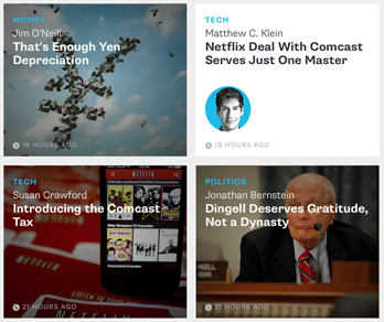
Most story “tiles,” as Bloomberg called them in a press release, include photos. But not every website is cut out for a heavy emphasis on visuals, and not every story includes compelling art. I mean, the choice facing readers in the screenshot below seems to be, “which photo of an old white guy whom I can’t even identity because he’s concealed by text should I click?” Nothing really stands out, especially because there’s very little variety in headline style:

Poynter’s latest eyetracking study found that most tablet readers said they preferred websites with this kind of design. But some expressed concern about feeling overwhelmed, and NBC News readers have commented at Poynter that they miss the ability to quickly scan headlines and identify the most important stories.
The eyetracking study also observed that, absent dominant design elements on a page, readers gravitate toward images of faces. Presumably, those visual cues don’t work as well if they’re blocked by headlines.
(The New Republic is another site ostensibly focused on visuals, but big images are often hopelessly and inexplicably obscured by headlines in stories like this one. At my first newspaper internship, where I did print layout, I remember dreading asking photographers for permission to place any text over their work, which they considered sacred. The web is a very different world.)
The natural question here is: Who cares about homepages anymore? Well, readers of Bloomberg View on anything but a computer will have to, because there are no links to related or recommended content in the new article view (which latches on to recent trends by embracing white space and offering omnipresent social sharing buttons). If you want to find more content on a tablet or phone, you have to jump back to the homepage or navigate to contributor or topic pages via menus that stay with you as you scroll.
I’ve argued before that mobile-first design is increasingly corresponding with screwy functionality on screens larger than 7 inches. Matt Yglesias was among those to attribute issues with Bloomberg View on desktop to a mobile-first strategy:
Credit to Bloomberg View for believing enough in mobile-first to make a responsive design that actually looks bad on desktop.
— Matt Yglesias (@mattyglesias) February 25, 2014
Responsive design guru Ethan Marcotte told The Atlantic that he didn’t think responsive was the culprit when it comes to this growing trend of cookie-cutter, grid-based sites. But Benton expressed skepticism in a post at Nieman Lab: “Far be it from me to dispute Ethan, but I think responsive has generally led to a regularization of front page chunks in order for them to reflow well on phones.”
Certainly responsive design doesn’t mean content has to suck on larger screens (as proven by the Boston Globe), but it hardly seems coincidental that visual hierarchy on large screens is disappearing as publishers grow ever more infatuated with small ones.
Related: Do mobile-friendly redesigns run the risk of frustrating desktop users? | NBC News reveals responsive redesign of website in time for Winter Olympics | Atlantic Wire rebrands, launches responsive site targeting mobile | NPR’s new redesign aims to create a less overwhelming reading experience


Comments