Three instant reactions to the new New York Times website, which went live this morning:
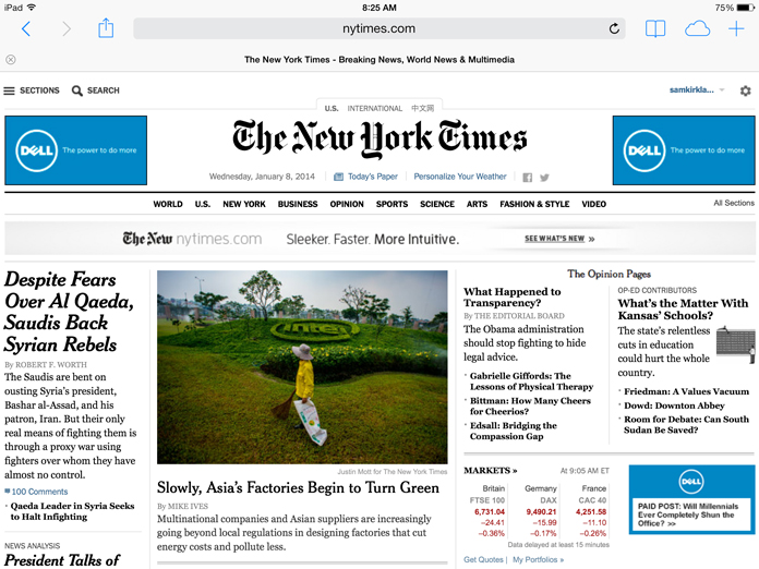
The Gray Lady online: less blue, more white
That each Times headline used to be blue seemed to be less an aesthetic choice than an antiquated signal to users that yes, indeed, you can click on these. Now, those headlines are black, going a long way toward cleaning up the design and making the Gray Lady less blue (minus the blinding Dell ads on the homepage this morning, of course):

Meanwhile, we’ve seen glimpses into the newspaper’s article-level white space goals for months now, and in practice it’s a beautiful change that allows stories to breathe — and for comments to expand onto the page next to the story whenever you choose. And no one on any platform is likely to complain about the end of story pagination.
Native ads? Yawn
You’re more likely to be fooled by one of those pro-Russia print supplements in the Times than by one of the online native ads everyone’s been fretting about. The format of the first paid post on the Times site fulfills Publisher Arthur Sulzberger Jr.’s pledge to the newsroom that “Our readers will always know that they are looking at a message from an advertiser.” The homepage link to Dell’s native ad doesn’t mix with links to editorial content, and even the URL is transparent: paidpost.nytimes.com.
Desktop strikes back?
I took some heat in December for suggesting that some prominent websites have become so focused on mobile optimization that the desktop experience emerges from the redesign process with new limitations and frustrations. But that’s not the case at all here. In fact, tablets seem to be left behind a bit with the new nytimes.com (the mobile phone version of the Times site was upgraded last May).
Maybe that’s because there are so many great options besides a web browser for reading the Times on tablets. I’m a big fan of the Today’s Paper web app, which the Times touted in December as a good option for both tablet and desktop reading. Subscribers can also access Times content via Flipboard and Google Play Newsstand, two platforms that also attractively include content from other news sources. And, of course, if you still want a separate, standalone app for Times content, there’s the native app on every platform, with millions of downloads since the iPad arrived.
So what seems particularly desktop-y about this redesign? The homepage, for one, which is difficult to read on my iPad Air and still requires pinching and zooming on my Nexus 7. The layout has been virtually unchanged — good for the visual hierarchy and array of story choices sometimes lost in mobile-oriented designs, but bad if you’re one of the dwindling-but-not-insignificant number of tablet readers who arrive at websites via the front door and not side doors like Facebook and Twitter.
Although text is frustratingly small on the homepage when visiting on a tablet, it’s eminently readable in stories. We’ve seen previews of what these article pages would be like in other projects; for instance, “Invisible Child,” the five-part series on a homeless girl named Dasani, was great to read on my Nexus 7. But I wasn’t fully struck by photographer Ruth Fremson’s images until I returned to the story later at my desk on my computer. At article-level, the new ability to view photos in large, glorious detail seems like more of an advantage for those consuming Times content on a desktop computer, laptop or perhaps large tablet than on a 7-inch screen.
(And here’s a big problem I noticed on my iPad: tapping photos in a gallery on my iPad advances to the next photo, but swiping — the more natural gesture for tablet users browsing photos — jumps two photos ahead in the slide show.)
Some stories just can’t be as immersive on small screens, so I’m glad the Times is positioning itself to succeed on large screens when warranted, particularly as we see more intensely visual projects that need the real estate — not to mention the fact that major interactive efforts rarely display well on lower-powered tablets.
Certainly some elements of the redesign — like the “hamburger” menu icon — take inspiration from mobile design, and there’s some new tablet-oriented functionality like the ability to clunkily swipe from story to story within a section. But this still notably feels like an effort to first satisfy desktop users, who account for two-thirds of traffic, as Ken Doctor points out at CNN.
And consider this: the videos the Times put together to hype the site launch show desktop browser windows and a cursor exploring the new design with old-fashioned clicks of a mouse. This is just the first iteration of a new, flexible Times web infrastructure that is sure to change a lot in the years ahead, but for now the Times seems surprisingly comfortable with a website redesign that’s friendliest to desktop users.


Comments