When the Los Angeles Times launched a six-part narrative earlier this month, they tried something a lot of news organizations aren’t doing anymore: Instead of running the entire story all at once, they published just the first chapter.
It was a gamble.
The story told in “Framed” first unfolded in California a few years earlier when a powerful attorney couple were arrested on suspicion of framing a PTA mom in Irvine. People who hadn’t followed the trials or headlines could easily search for news of what happened next.
The Times ran that first chapter with a teaser at the bottom that flagged the next installment and gave readers a chance to sign up for their “Essential California” newsletter. Subscribers would get the next chapter in the story sent to their inboxes as soon as it published.
“It ended up being a really powerful tool to get readers to return back to the site,” said Lily Mihalik, a senior web designer, in a phone interview.
That strategy, along with the compelling story, thoughtful design and strategically placed subscription lures, all worked.
The series, which attracted more than 3 million unique pageviews, also generated more than 50,000 new subscribers to the newsletter. And, in the series’ first week, the Los Angeles Times saw hundreds of new print plus digital and digital-only subscribers sign up, according to an internal memo sent to the newspaper’s staff.
Both Christopher Goffard, the writer of the series, and Mihalik tried something different with “Framed.” He moved beyond salacious tabloid headlines everyone already knew. She tested both old and new ideas with the presentation. The story, and the corresponding increase in subscribers, show that a strong focus on audiences can yield powerful results.
The Los Angeles Times used a gif with the next day’s chapter to tease ‘Framed’ and attract newsletter subscribers.
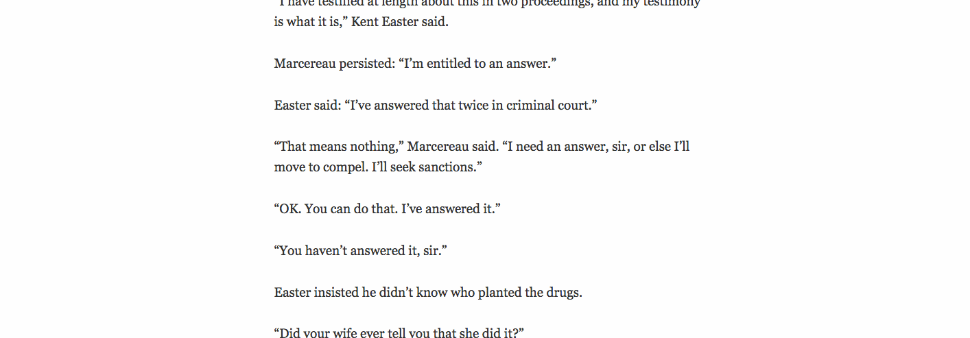
Meet the Easters (again)
Goffard first covered the story of the scheming lawyers in 2012 when Kent and Jill Easter were arrested.
“It made the Dr. Phil show and a cable show called ‘Momsters: When Moms Go Bad’ and other shows,” he said via email. “But the tabloid aspects of the case had predominated and it would have been easy to dismiss it as salacious and sensationalistic.”
A lot of reporters did just that for years, said Goffard, part of the Times’ 2011 Pulitzer Prize-winning team for public service.
But the initial TV hubbub was just the start of the story, he said, “and we wanted to tell the deeper one.”
Goffard didn’t witness many of the early scenes in the series and had thousands of pages of documents to sift through. He also spent months gaining the trust of Kent Easter, though never managed that with Jill Easter or their friends.
Despite those obstacles, Goffard’s longread is hard to stop reading. “Framed” unfolds with several characters, bits of documents and short audio and video clips that bring those people to life.
That feature was especially important since the art for “Framed” was mostly limited to shots of Irvine and portraits. Mihalik worked with graphic artist Eben McCue on an audio and video solution.
For readers, that means bits of audio with the characters from the story, timed to highlight the words as they’re spoken and a small headphones icon as a cue for people with the audio off, too.
“I thought they were great, and Lily made it look spectacular,” Goffard said. “These things weren’t possible when I started doing long stories in the 90s. You couldn’t click on a button and hear the voices of the participants.”
The golden ratio
Mihalik has previously worked with compelling stories that don’t have compelling visuals. She and her team found solutions to that, including the audio and video bits. But with “Framed,” she tried something she’d never attempted before: She applied the golden ratio to the text itself.
“I knew that this would be one of the longest reads we’d publish all year, especially for readers binge-reading the entire project,” she said. “I wanted the reading experience to be as easy on their eyes as possible, so I looked to the golden ratio for a little help.”
While researching readability for the web, Mihalik was inspired by a post on “the mathematical symphony of typography.” She applied the golden ratio to the text’s max width, font size and line height. She also boosted the text size on mobile up to 20px. It normally reads at 16px on L.A. Times’ mobile site.
“I just think math is so powerful and we should use all the tools in our tool belts to make a seamless experience,” she said.
‘Support our narrative journalism’
“Framed” brought challenges Times’ designers anticipated, such as a lack of strong art, and some they didn’t.
Mihalik worked with developer Evan Wagstaff to optimize page load time on both desktop and mobile. But when she saw, after the first day, that the page was still loading slowly, she went back in for triage, recompressed all the videos and added lazyload scripting to lighten page weight. Essentially, that allows the page to load images just before users see them, cutting down on perceived load time.
“I had lots of ideas on how to make the experience more polished, gifs loading and reloading each time they come into view, videos autoplaying on desktop – but the truth is you really have nothing if your page won’t load, or it takes more than a moment for the elements to gel,” she said.
Working on “Framed” was also a good reminder of the importance of being flexible, Mihalik said. The lack of art put other options on the table, including leading with some of the deposition. She dropped that idea for a simple image of Irvine that serves as a magazine-like anchor for the series. McCue also created several different options for the animated text that starts each chapter. At one point, they reflected the content of the chapter itself. In the end, they stuck with McCue’s first treatment and kept the look uniform and simple.
“We can do cool stuff,” Mihalik said, “but should we?”
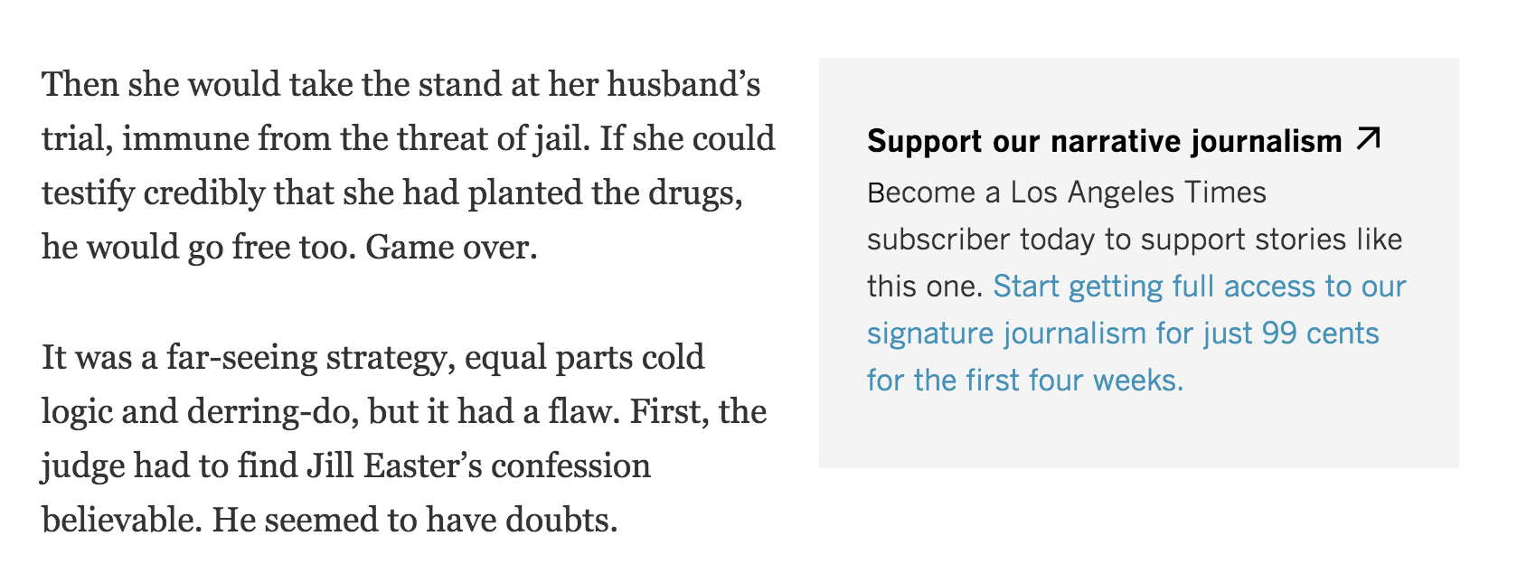
One of the final successes of “Framed” came from a simple gray box throughout the story. Here’s what it says:
Support our narrative journalism
Become a Los Angeles Times subscriber today to support stories like this one. Start getting full access to our signature journalism for just 99 cents for the first four weeks.
Mihalik added the subscription lures near interesting parts of the story with particularly compelling reporting. It said, basically, like this? Look, you can have more for 99 cents, Mihalik said.
And it worked. The response to the subscription play attached to “Framed” was the best yet for the Los Angeles Times. The Times tried the same thing with the Oxycontin series, but it was much less successful. Mihalik thinks that’s because the box was paired with a Labor Day sale.
“Framed” pushed against a few pieces of conventional thinking, both through the story itself and in how it was presented.
One is that people won’t come back for more. They did. The other: Stories have to be chopped up and easily digestible these days. Instead, the Times found that people will read a compelling story, even if it’s long. One day, Mihalik checked into the series and saw people were spending about 16 minutes there. Another day, they were spending 14 minutes and 50 seconds. The series has elicited some of the highest times on site she’s seen.
“It’s all about the story,” Mihalik said. “That sounds sort of trite, but it’s true here.”
Screen shot, Los Angeles Times’ ‘Framed’