One of the most common questions I get as a technical person in media from new journalists is, “What are your favorite storytelling tools?” There’s a big focus on tools and the next big thing in figuring out how best to tell stories. Journalism schools have taken awhile to catch up training cub reporters about how to tell stories in new ways.
For people who are reading your stories on their phones and mobile devices, it can be difficult to stick with a story that is a wall of text, no matter how well-reported, lovely and descriptive the text may be. Our eyes are drawn to the next thing laid out for us, and describing a new idea or quote is a good opportunity to insert an image, pull quote or storytelling element. Here are some of my favorite easy-to-use storytelling tools to get started with:
Storify: for breaking news on social

Screen shot, Storify
What Storify does really well is its capacity to search social media for any topic, then drag and drop within its story editor to build a story. You can create stories, compile relevant quotes from across social media platforms such as Twitter, Reddit and YouTube, create multimedia timelines that show the unfolding of events that were told by one or more people across platforms, and update as it’s happening. Seeing everything compiled in one place without having to use complex tools can help to organize the information coming in about breaking news, recognize what’s true or false and help suss out what the most valuable angles are to cover on your own platform.
Autotune: for data visualizations
Screen shot, The Verge used Autotune for this piece.
If you don’t work in data, it’s easy to imagine that data visualizations involve lots of spreadsheets, crunching numbers and complex algorithms. Many newsrooms have staffed up with data viz designers and analysts who work alongside traditional reporters, and the two skillsets are completely complementary. A visualization of data can simply be a chart or graph that shows the result of a poll or study that can otherwise be difficult to understand in text, and people who work in data design understand a few other ways to represent information visually.
Autotune is an open-source suite of storytelling tools that was built by Vox Media’s editorial products team. Charts, graphics and quizzes are easy to build for different platforms and are supported by easy-to-read documentation.
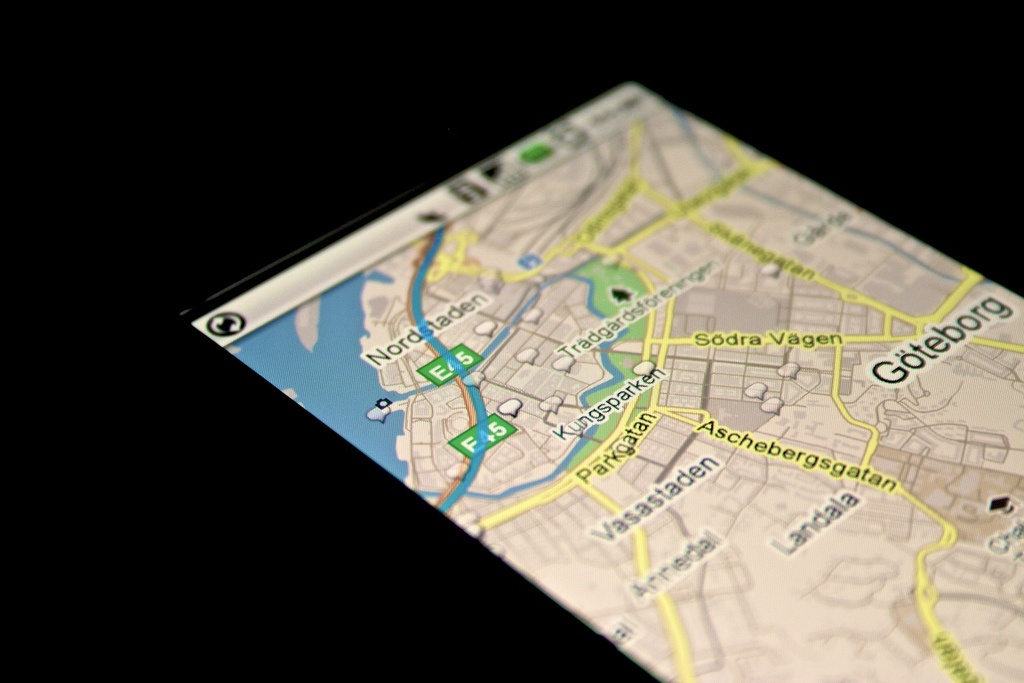
Google News Lab: to discover trends
Screen shot, Google News Lab
Google’s News Lab has a huge suite of tools available that help with research, gathering information and distribution. Two things that are especially helpful to reporters are Trends and Maps (including the Crisis Maps tool). On slow days, it can help to see what people are searching to kickstart new ideas, and being able to discover the popularity of search terms over time can also help shape a story about any subject.
With Google Maps, reporters can build interactive maps that they can embed in their own story editors and publish to their own platforms. In many cases for news organizations, it’s a lot easier to take advantage of the work Google’s engineers and designers have already done to display maps rather than designing and building responsive maps, plus Maps have been around long enough that customer support and training resources are available to understand how the tools work. Pinpointing locations on Google Maps are great for local roundups featuring event or places to go, or to give readers context of where overseas events are happening.
Gifs: for hot takes
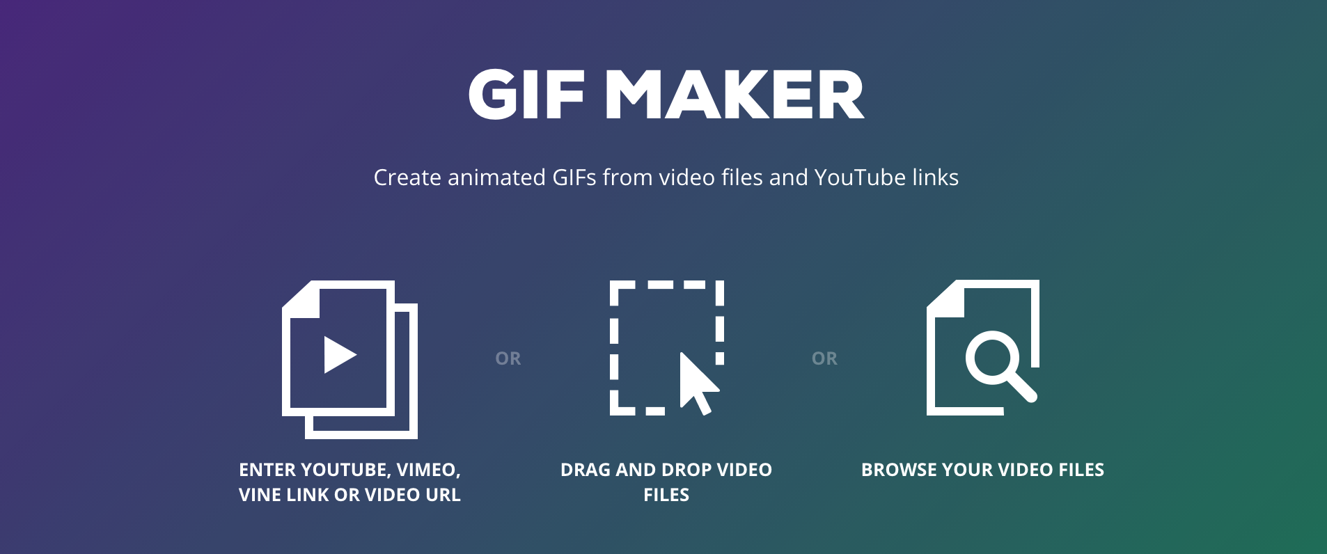
Screen shot, Giphy
However you pronounce them (“giff” or “jiff”), gifs are invaluable in highlighting the important parts of stories, especially on mobile. In a story with a long video or click-to-play, readers aren’t likely to stick around till the end or want to see what they’re getting into before committing to watching the video, and in any case, video streaming depends on the strength of Internet or mobile connection. It can be helpful to insert a full-length, third-party video in an article with an accompanying gif that pulls out the highlights, especially when covering sports, awards and events.
How do you make a gif? Usually, it involves editing a few seconds of video to create a smaller, embeddable series of images in stories, which is a simple function that various programs can handle. Giphy can help convert a gallery of images, YouTube videos or uploaded videos to a quick gif that helps cut down on the traditional process of pulling out Photoshop.
The beauty of starting to see different ways to tell stories is that you have all the options to use the most effective tools for your stories in exactly the way you like, whether that’s basic or advanced. Starting with these tools can help with learning the basics of information design and consider how readers are seeing and reading your stories in different ways besides desktop. It opens up new ways to see how you can reach your readers, wherever they’re seeing your stories.


