
The Outline, the new company/website/technology platform from Joshua Topolsky’s band of media cool kids looks completely different from most digital publications. It also feels very familiar, at least for those of us who still read print magazines in 2016.
This is intentional. In an interview with The Wall Street Journal published this morning, Topolsky — who oversaw a splashy redesign of Bloomberg — said he wanted The Outline to be “a next-generation version of The New Yorker,” presumably with fewer arch cartoons and effete punctuation marks.
“I definitely had magazines in mind when we did it,” the Vox Media alumnus told Poynter Monday afternoon. “I’ve been thinking about this for a long time. When we launched Vox and The Verge, I was saying, ‘how do we make magazine-like content for the web?'”
So far, The Outline seems to be delivering on that promise. Scrolling through the site — especially if you read it on your phone — feels like sitting down with the print edition of a new magazine. Above all, 15 minutes reading The Outline leaves one with the impression of consuming something with a beginning and an end, which is a rarity for news websites.
Here are a few other reasons why The Outline looks like the future of magazines:
It feels like a cohesive whole
Most websites — including this one — have a few things in common: type size, font type, photo treatment, color palette and so on. By standardizing these elements, designers create consistency that make publications more readable. If they’re really lucky, those elements work together to form a gestalt — a unified whole that has more personality than the sum of its parts.
For Topolsky and company, a bunch of styles are working in concert. The font and images are consistent (a no-brainer), but there’s also a lot of quirky design elements that, to this observer, add up to a cohesive experience: wacky animal cutouts, White-bordered clip art and Vox-style card stacks, among other things.
This was deliberate, Topolsky said.
“There is value to focus,” he said. “There is value to voice. There is value to look and feel.”
Not everyone agrees that the design is reader-friendly (Nieman Lab said it “burns the eyes”) and others have observed that it’s hard to hunt down specific stories.
The ads are big and in-your-face (without being annoying)
The Outline’s ads (which pop up as cards after infinite scroll pages) imitate the experience of stumbling across a full-page ad while paging through a print magazine. They manage to be simultaneously surprising and unobtrusive, which is a rarity for digital advertising.
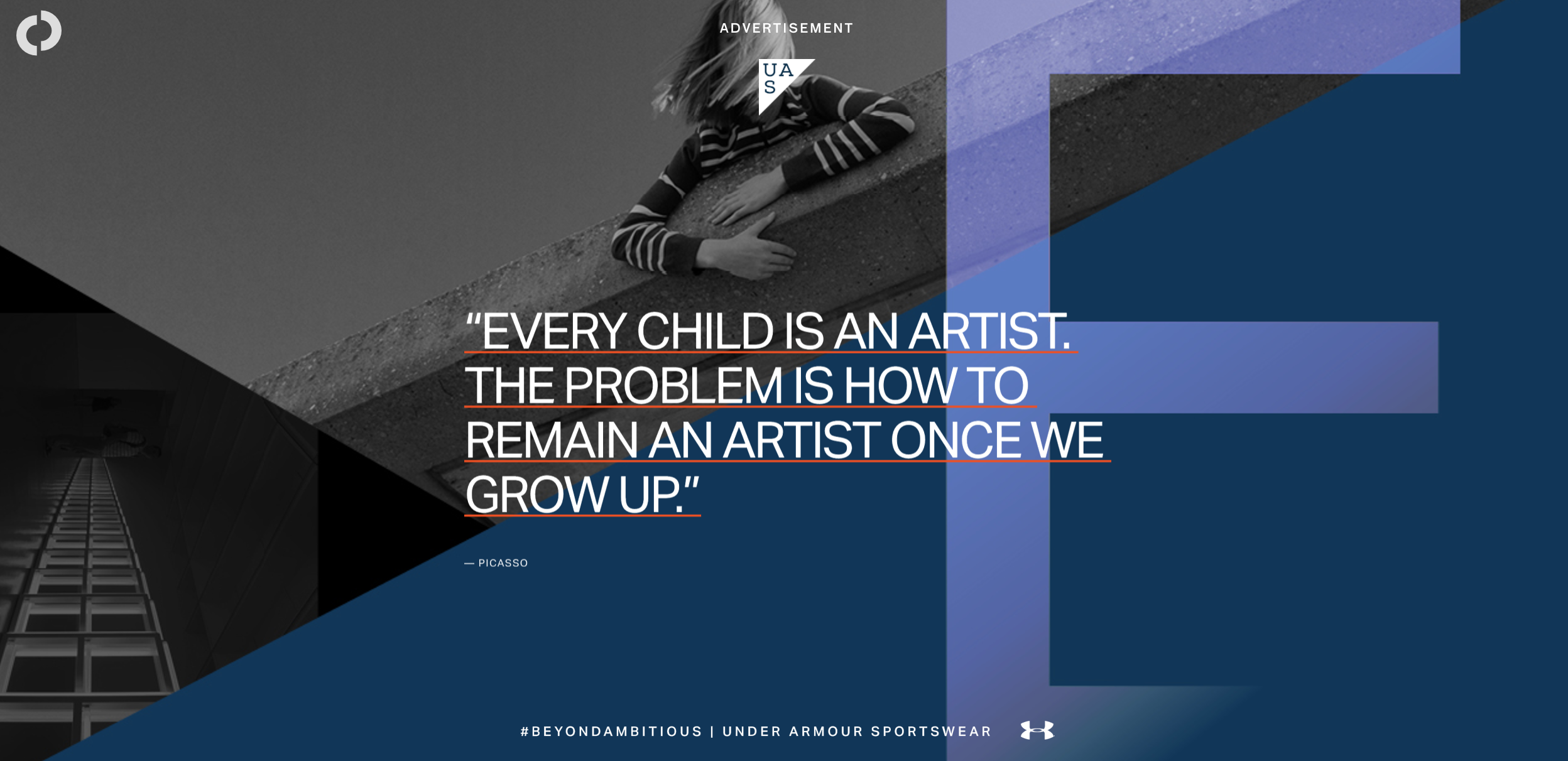
An infinite scroll advertisement on The Outline. (screenshot)
The Outline is finite (and infinite)
The Outline simultaneously defies and embraces a common theme in digital design: the infinite scroll.
On one hand, visitors to the new site are greeted with a finite experience: The homepage includes a table of contents (a holdover from magazines) several bundled topic sections and an introductory note. You can peruse the entire site in seconds.
But once you dive into a specific article, The Outline transforms into an infinite scroll site, one that serves up a new article as soon as you’re finished scrolling through the last. The design allows readers dip their toes in or dive to the bottom, depending on how much time they have to spend.
“We wanted people to be able to pick and choose how they wanted to move through stories,” Topolsky said. “…To me, it was very important to create an experience that was immersive but not overwhelming.”
Stories are clustered
The conventional wisdom about journalism in the age of social media has become a cliché. Content is unbundled. Media is fragmented. Side-doors reign supreme.
That’s why The Outline’s decision to package stories together feels a little bit like fighting gravity. Scroll through the homepage, and you can see clusters of articles that are in conversation with one another: Drugs. HBO’s “Westworld.” A section just for newsy stuff from around the web. Does this organizing principle work in a world where most people are discovering stories on Facebook, Google and Twitter?
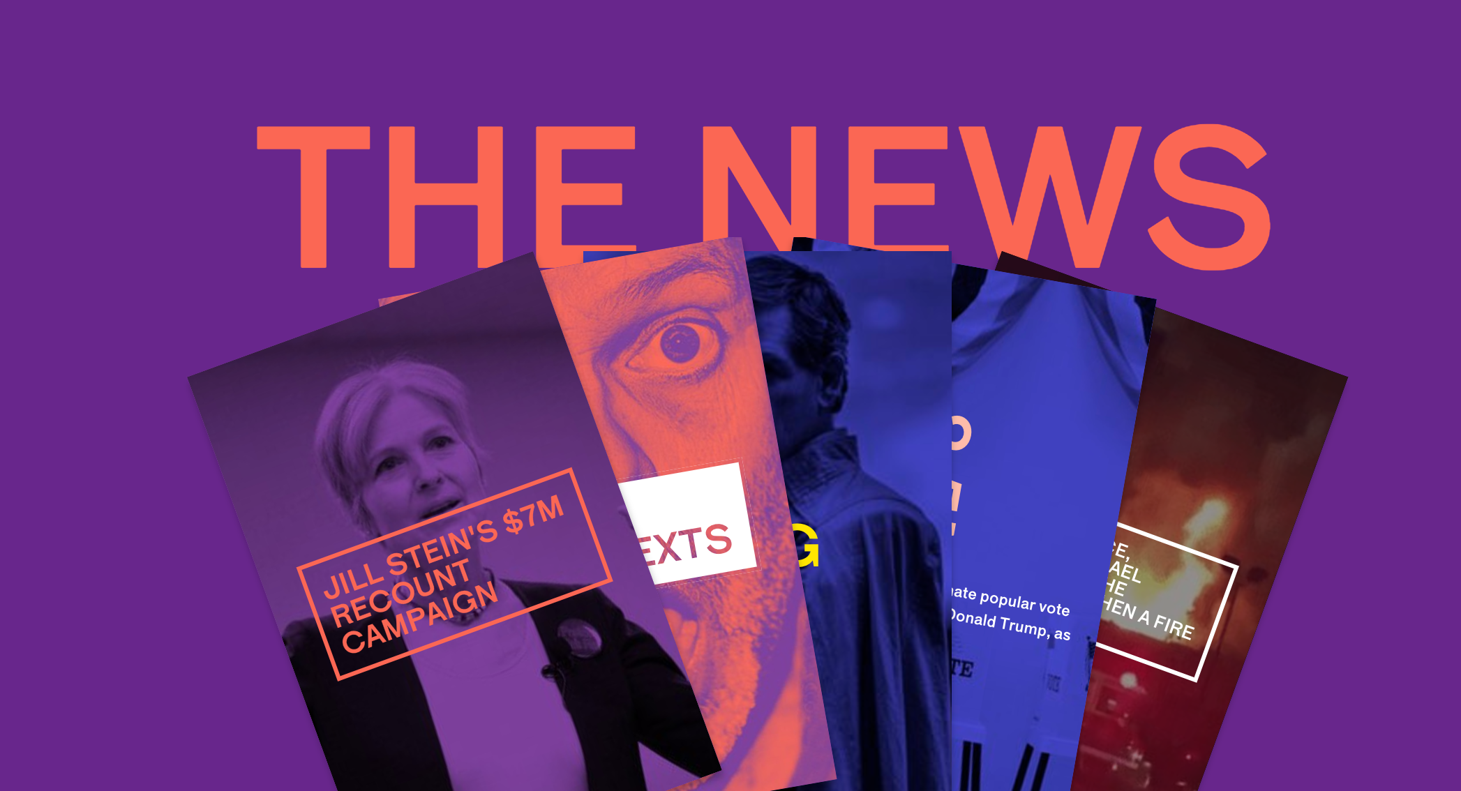
The Outline’s clustered stories. (screenshot)
Part of the answer seems to be that Topolsky views maximizing drive-by traffic from social media as less important than creating a cohesive experience for readers. In fact, the bundled stories are in some ways an alternative to social media, he said.
Especially in an age where advertising and reader attention is shifting overwhelmingly to companies like Facebook and Google, cultivating a loyal on-site audience is especially important.
“I think that there’s a lot of our audience that wants to step away from that non-stop flood of noise on social,” Topolsky said. “And there’s a set of people that want to experience this as a first-party product.”


