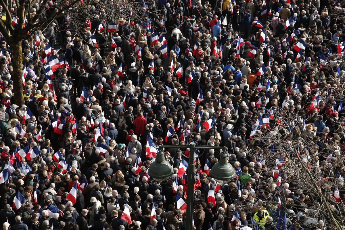
Donald Trump is neither the first nor the last politician to mislead the public about his crowd’s size.
Long before the 45th President of the United States was grossly overestimating attendance at his inauguration, another tycoon-turned-politician was exaggerating his own turnouts.
Silvio Berlusconi, a fixture of Italian politics for two decades, claimed more than 10 years ago that 2 million people attended one of his rallies in Piazza San Giovanni, Rome. The square can’t even fit half that number.
Google Earth Pro and a basic understanding of crowd sizes have long made it possible to get a general sense of the truthfulness of claims like the ones above. Multiply the area of a place by its average density and you can get a rough idea of the people present.
Related Training: Math for Journalists: Help with Numbers
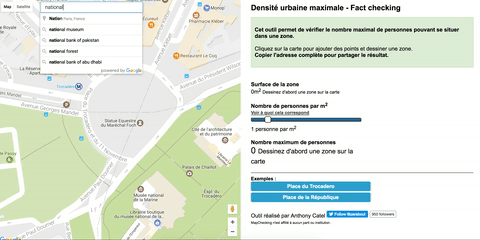
One French developer just made this process a lot faster. Anthony Catel, based in the southern French town of Aix-en-Provence, launched a tool called MapChecking. Catel said he was moved to build MapChecking after hearing the campaign of French presidential candidate François Fillon peddle a “soap opera story” about the candidate’s capacity to corral 200,000 people in the Parisian Place du Trocadéro to support their embattled icon.
“I just did this in one hour last Thursday morning, to be honest,” Catel said. “I thought, ‘lets do something simple that journalists and readers can use to stop this bullshit.'”
In the first two days, there were 40,000 requests on the Google Maps API the tool rests on, mostly driven by coverage from Libération and Télérama. In the analytics, Catel also found referrals from the webmail of the Bayonne municipality. The city hosts a rowdy festival every year and perhaps city officials were looking at estimating their crowd sizes, Catel said.
So how does MapChecking work? And what are its limitations?
1. Find the public space
Go to the website. Search the public space you want to investigate. Below, we looked up the National Mall in Washington, D.C., the location of Trump’s inaugural ceremony.
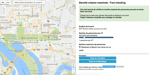
2. Outline the area of interest
Click the cursor on the borders of the area occupied by the crowd. MapChecking is flexible and can select areas that are more complicated than the rectangular National Mall.
Having a solid grasp of the terrain is important though: The selection in the GIF below includes the Capitol Reflecting Pool, a body of water unlikely to have contained any onlookers on the day of Trump’s inauguration. Toggling from map to satellite view may help avoid silly mistakes.
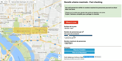
3. Estimate the density of the crowd
Catel read an article on Le Monde indicating that three people per square meter makes for a crowded public space. Then “some guy on Twitter” shared with him the visuals of crowd density published by Professor Keith Still of Manchester Metropolitan University, so Catel implemented a toggle that goes from less than one person per square meter to seven.
Determining the crowd density is by far the hardest part of the whole endeavor. For one, as Still notes, density at public events is not homogeneous.
“Crowds are packed to a higher density closer to the point of interest,” Still told Poynter.
A better estimate would divide the National Mall into several areas and estimate density for each quadrant by looking at still images of the event. The tool is also only really useful for stationary crowds: marches and demonstrations are harder to quantify.
During large events, organizers place infrastructure such as barriers and cordons to keep the movement of people safe. This infrastructure takes away space from the overall area.
“As a quick guide,” Still says “2.5 people per square meter is a good estimate for public events such as parades.”
4. Remember, this is just an estimate
MapChecking is great to get an initial estimate. The resulting number should not be taken as a precise figure, however.
Still and his associate Marcel Altenburg, who provided more elaborate calculations of the crowds at Trump’s inauguration, use what they call a “RAMP analysis” (it stands for Route, Areas, Movement, People). This takes into account a variety of additional variables.
“Spatial analysis is OK for after the event analysis,” Still said. “But for real-time decision support you really need to understand the crowd dynamics.”
Catel is not involved in journalism or politics, so he doesn’t envision investing much more time on MapChecking beyond translating the website in English. He is also under no illusion that MapChecking offers anything more than a “Fermi estimation” — essentially a justified guess.
“It’s just a dumb tool,” he said.
Dumbness notwithstanding, MapChecking offers a quick solution for fact-checkers looking to analyze politicians’ bombastic claims about their crowd size. Fillon’s team suggested — entirely unrealistically — that on March 5 their man had crammed 200,000 or even 300,000 supporters into the Trocadéro.
Even had Fillon filled the square with an incredible seven people per square meter and then stacked another layer of people on top of them, the crowd would still have been only 130,000-strong.


