This week, the Detroit Free Press’ online logo changed from Blackletter typeface to a custom typeface – Unify Sans and Unify Serif.
From this:

To this:

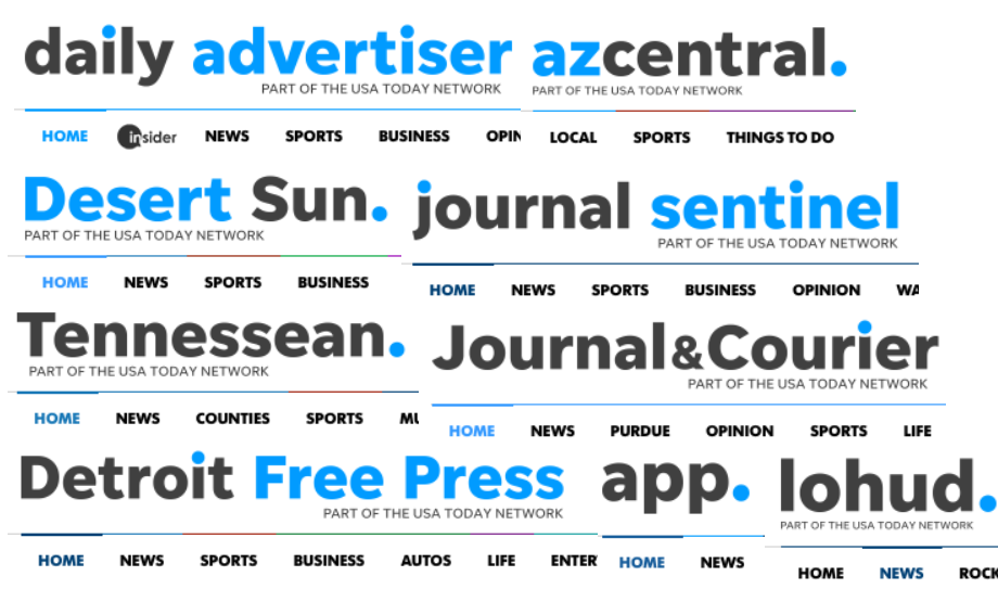
The change didn’t just happen in Detroit. The online logos of eight other news organizations in the Gannett/USA Today Network family – Palm Springs, California, Phoenix, Arizona, Nashville, Tennessee, Asbury Park, New Jersey, Milwaukee, Wisconsin, Lafayette, Louisiana, Lafayette, Indiana, and Westchester, New York — were also altered.
In the next several months, all of the local news organizations in the USA Today Network will follow, said Andy Yost, Gannett chief marketing officer, via email.
“When we launched the USA Today Network in late 2015, all of our brands came together as one unified network,” he said. “With this, we have the opportunity to bring that change to life visually.”
Work aimed at visually uniting the 110 news organizations across the network will continue through the year. The changes will also roll out in print, where the mastheads won’t change but the fonts will.
Yost said the response to the changes so far has been good.
“Focus groups of readers have shown a unanimous positive response to the new typeface,” he said. “The reaction from the markets so far has been very positive and employees at these markets are very excited to see the changes.”
Maybe not everyone.
Alan Stamm reported for Deadline Detroit a different kind of reader and newsroom response.
‘This is dumb. New Coke deja vu,’ Ed Seward of Southfield posts elsewhere on the social site. ‘Let’s hasten our decline, shall we?’
Twitter reactions include ‘Blasphemy,’ ‘Boo,’ ‘Lame,’ ‘Sad’ and ‘No! Change it back!’
While the goal may be to — as the custom typeface says — unify, it’s also specifically what makes the change hard for some.
“The typography of a newspaper is its DNA,” said Steve Dorsey, vice president of innovation and planning at the Austin American-Statesman. Dorsey previously worked at Freep as deputy managing editor of design and innovation. “Everything else changes every single day: the photos change, the words, but that typography is the one thing that’s unique to that publication.”
You could argue that, specifically with a national ad network, it makes sense to have a uniform look, Dorsey added.
“Who knows. The more you take out that local flavor, the more challenging it is to uniquely connect with an audience,” he said.
That local flavor is precisely what local news organizations should be investing in, said Roger Black, an art director and design consultant who has worked with news organizations around the world. Gannett/USA Today Network’s push for visual unification isn’t new for media companies, he said. Hearst did it. McClatchy tried it.
He thinks of it a bit like chain restaurants vs. local ones.
“I think it’s the same thing,” he said. “Maybe the food’s good. Maybe you’ll eat there. But it doesn’t feel like local. It doesn’t feel like you.”
What he wants to know, Black said, is: What do locals think?
When The Dallas Morning News went to just Dallas News online earlier this year, the logo also changed. Note the original logo is still there, though — for now.

“Any time you make a change, people react,” said Managing Editor Robyn Tomlin in an email. “Some love it. Some hate it. We heard a lot of feedback on all aspects of the redesign, including a fair amount on the branding change. Many liked that it was more modern and fit with our new design. Some felt like it wasn’t ‘newspaper-y’ enough. And some felt like we were abandoning our history. We ultimately decided to use the ‘powered by’ to help bridge the gap, but that will likely fade away at some point.”
It’s interesting to see people riled up about the change in Detroit, Dorsey said, because the original digital logo wasn’t the original print one. It was a kind of typewriter typeface that said “Freep.” It continued changing over time, said Dorsey. He shared a few of the old logos:
![]()
![]()
“It’s surprising to me in some ways,” he said of the reaction to this latest change. “It’s also heartening, in some ways, that people are reacting so strongly.”
Here are the other logos that the USA Today Network rolled out so far. What does your news organization’s logo look like online? Does it reflect the history of the publication or where it’s trying to go? Take a screenshot and send it and I’ll build a collection below.
Correction: An earlier version of this story put Milwaukee in Minnesota instead of Wisconsin. It has been corrected. We apologize for the error.