
Depending on who you ask, the homepage is either on the verge of death, surging back to life or stuck in a state of unending metamorphosis.
Here’s what you don’t hear as often: An argument that digital homepages should look something like their teetering-on-the-verge-of-extinction, dead-tree predecessors.
But that’s more or less the position taken by the team over at Vox Media in a blog post announcing the new redesign of Vox.com.
The team took a retro feel for its first overhaul of Vox.com’s homepage since 2014 because it conveys credibility and allows the team to impart context around top stories, wrote Yesenia Perez-Cruz, Vox Media’s design director:
The first thing you’ll notice when looking at the desktop homepage is we’ve gone with a newspaper-inspired layout, which is a departure from the previous photo-driven design. In our kickoff meeting in January, the Vox team told us they needed a homepage that felt credible, smart and represented the depth and breadth of their coverage. Additionally, Vox had grown, both in terms of audience and coverage areas, since their last homepage refresh. Their homepage needed to reflect their new editorial strategy.
To us, that meant creating something that was more serious and functional, but still retained Vox’s distinct branding. We explored several layouts that focused on functional density before settling on this newspaper layout.
The mobile homepage, by contrast, appears in the now-ubiquitous vertical feed format, which has long dominated social networks and is now becoming standard-issue for news websites:
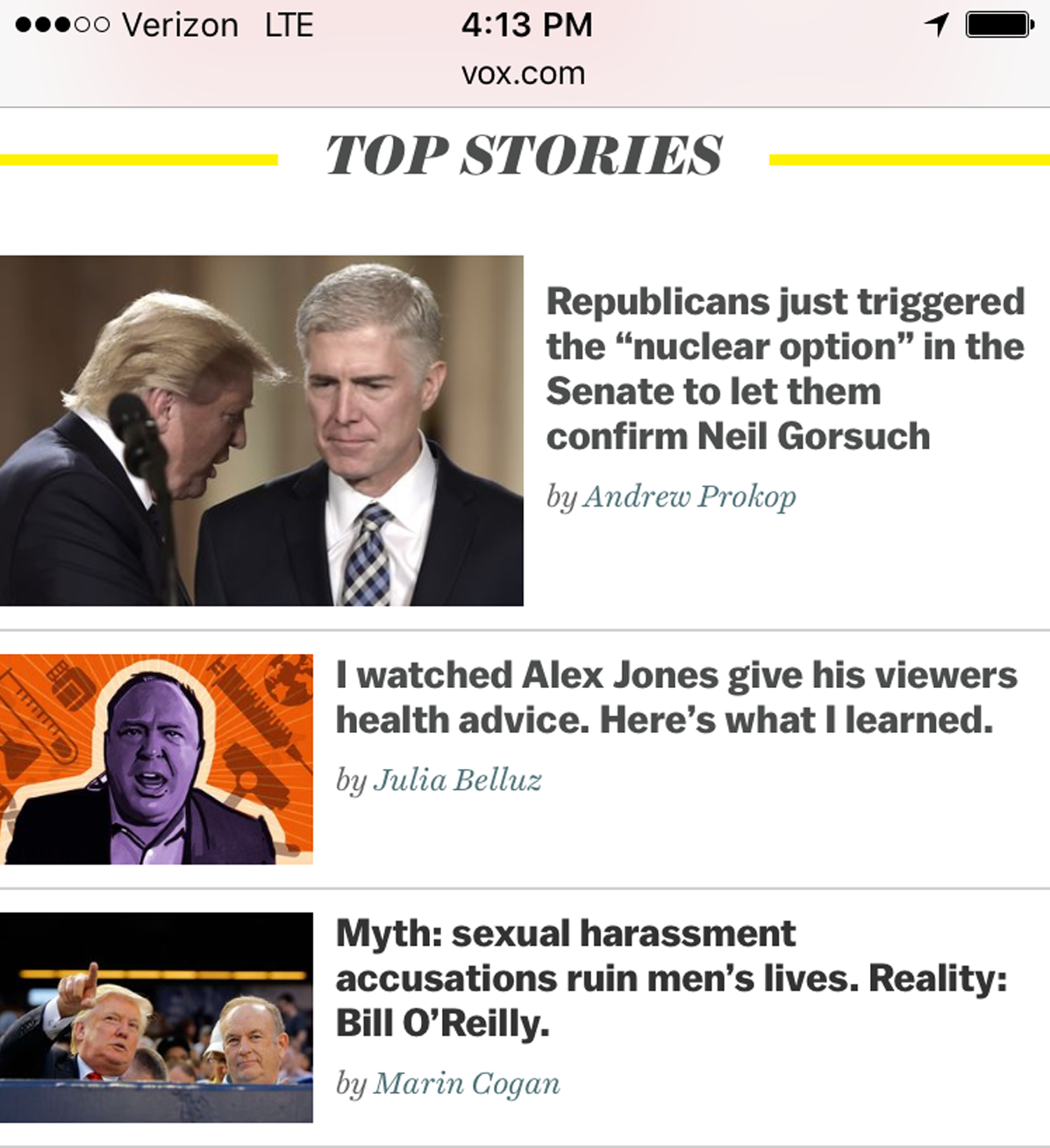
Screenshot, Vox.com.
Another focus of the redesign was the ability to emphasize various products and brands on the site, Perez-Cruz noted. Vox, which caters to the wonkiest wonks with podcasts from its star journalists, built into its redesign enough flexibility to make sure those products have visual weight commensurate with their importance.
We also have a new podcast module which looks especially snazzy with the new podcast cover art our Brand Identity team has designed. We are highlighting video and podcast coverage to demonstrate how Vox expanded coverage beyond written words.
Vox’s redesign is another testament to the curious persistence of newspaper design in the digital age. As others have noted, print design is a form that has been refined over several centuries to direct wandering attention and encourage serendipitous discovery.
If you want to display images and text to convey a sense of hierarchy and nuance, you could do a lot worse than looking at a well-designed newspaper.


