Gradually, without much notice that I can detect, the reproduction and display of news photos is now much superior in digital format than print.
I first picked up on this evolution a couple years back when my friend Bill Marimow sent me a link to his daughter Ann's in-depth portrait of a single damaged heroin addict in the Washington Post. Striking pictures were combined with nicely paced placements as the story unfolded. I don't see the Post in print but could not imagine the display could be as good.
With time on my hands convalescing last summer I took a dive into a New York Times restaurant review of the relaunch of The Grill, one of the two new restaurants in the old Four Seasons space. Big deal in New York dining out circles, and it was commemorated in a stately appraisal by critic Pete Wells and a gallery of nine bright photos showing both the look of the place and some representative dishes and drinks.
Check the review in print, and you would find the same photos — one in color, cropped small on the section front, the rest in an undersized black-and-white montage with the jump. The larded guinea hen breast had an unfortunate resemblance to a mud-pie on a plate.
I got seconding votes on my thesis from two noted designers. Later I spoke with three New York Times photo and design executives for a sense of the state of the start in three-way illustration plans — one for digital display, one for print and a third for the smaller smart phone screen. (More on that in a moment).
But if digital photos are better, so what? Readers of my generation, when faced with the choice of reading a story in digital or waiting for the print version, may be making the less rewarding choice by force of habit.
And there is a business implication. For many, like me, the flipped value equation takes a while to sink in. Despite the current push for paid digital-only subs, I don't expect the industry to adopt slogans like "Looks twice as good, costs half as much." But maybe a flight to quality in format choice is coming.
I asked Roger Black, a Poynter tenant until recently, whether the photo display scales had tipped to digital. "Yes, that's probably so," replied Black, who has designed and redesigned publications from New York Magazine to the National Enquirer over a long career. "It's a product of many different technical improvements over time."
Mario Garcia, design consultant and former Poynter faculty member, offered a more detailed take in an e-mail exchange:
"Indeed, photos have become better in the digital age. Just think that the average citizen is now a photographer and a videographer if she has a smart phone handy. My own iPhone X is the best camera I ever owned (and I am almost 71). It is a toy that is easy to use and I can refine the focus and lens, go into portrait mode, even enhance selfies."
So the audience, especially younger people, Garcia continued, "is more apt to value photos and, of course, to evaluate photos. We must be better photo editors, and we must publish photos that have greater impact." But he cautioned that the absence of space restrictions can be a trap: "Digital spaces are not bottomless pits into which to pile up photos. People have limited time, and curating visuals is part of an editor's job."
How does this play out in practice at the staff-rich New York Times? "There is a lot more freedom (in digital)," Meeghan Lohram, deputy photo editor told me, "but we've moved past the slide show as the luxe way to display" a group of photos. Lots of photo editing attention now goes into "how they can play into the text."
An early example was Andrea Elliott's novella-length series four years ago on a homeless 11-year-old child. The photos tracked the story-line of each chapter closely, adding detail brick by brick, to great effect.
Besides accommodating many more images, Lohram said the maturing digital options underscore the good practices of bringing the photo-journalist in very early in the assigning process or sometimes letting the photos drive the text rather than vice versa.
As months and years go on, the Times is honing its protocols. A digital plan comes first to be sure to assemble a group of illustrations that use space well and may include options such as video and voice. That's always true for high-impact projects long in the making, but the organization can do a version of the same for a big breaking story like the Las Vegas shooting.
Also, since so many readers will come to a story in mobile, there are another set of considerations for that option. Those range from the obvious — picking photos and other imagery that works in vertical display — to a little more subtle like a tilt to screen-by-screen galleries that still may work better than placing pieces of art in the text.
Steve Duenes, assistant masthead editor for visuals and multimedia, sent me a number of recent examples:
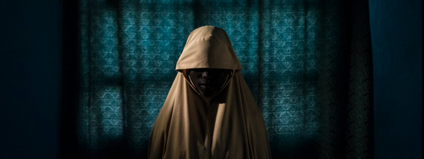
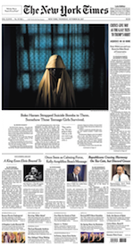 One is a chilling report from October on Boko Haram's abuse of young women and efforts to use them as suicide bombers. The digital version utilizes several stacks of portraits, 12 in all, in a common style, spaced through the text. That design works well either in tablet/desktop or smart phone display. The print version, plenty impactful as well, has a front-page image played big, then two more large and four smaller ones selected for a two-page jump.
For breaking coverage of the California mudslides, designers picked seven photos for the digital version, four (not all the same) for page 1-A and the jump.
A theme in Duenes' examples is that while print comes later in the process, it doesn't get short shrift. There is room created and big display for images that merit the treatment.
Spokesman Jordan Cohen also sent along a couple of recent examples of special sections — a monthly edition of the New York Times for kids and a special puzzles section (unfolding to one giant crossword) that exist only in print. Those are special treats of sorts for the print portion of readership.
Still, Looram conceded, for stories that are neither big news nor a special project, comparatively tight space and lack of color availability can give the print treatment a best-under-the-circumstances look — as was the case with the restaurant review I cited earlier.
I asked what is new or next in The Times' approach to these challenges. Will Davis, assistant editor for news platforms, said an initiative known internally as the Oak project, involves a new editing interface for the CMS "that will make it easier to execute sophisticated visuals"
"We have been working on this for a while," Davis continued."It's like taking the rails off," permitting text and visual match-ups that would not be possible with restrictive templates.
Of course the Times has photographers, photo editors and designers by the dozens if not hundreds. But I see examples in a range of papers of imaginative digital presentations or better story treatments to match the dimensions of a smart phone.
At the same time, I think it is safe to say that very few papers, even the big national ones, will be investing much in improved print color capacity, as their audience steadily swings more digital.
I would thus look for the current quality gap to widen — so much so that even the hardest of print diehards will want to turn on their computers and take a look.