Forbes
Wilson Andrews, The Washington Post’s information designer, discusses his data visualizations and the progress of the field in a Forbes interview. “The kinds of graphics that are now being done, especially online, are on another level than what was being produced several years ago,” he says. “Long form journalism is just as important as it ever was, but often long form pieces are greatly enhanced by smart and clear data visualization.” He says that he starts with the simplest possible design, only adding movement and interactive elements if they will help people understand the information. Examples of his work are in the interview. Related: WNYC’s John Keefe finished up his New York evacuation map as he rode the subway to work last week.
Uncategorized
Data visualization ‘on another level’ compared to a few years ago
More News

How Poynter transformed a hands-on workshop into an email course
Lessons learned from an experiment in building a new journalism project
April 24, 2024

Opinion | Journalists at Columbia are leading the coverage of their campus
The Columbia Daily Spectator has expertly documented tense protests over the Israel-Hamas war inside and outside the campus.
April 24, 2024

Q&A: Mina Kimes on her run from acclaimed sportswriter to Emmy-nominated NFL Analyst
The ESPN star explains how she got over her fears (and the trolls) to get better at discussing the sport she loves
April 24, 2024
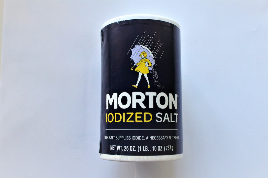
No, Morton Salt and other table salts do not contain sand and glass
Excessive consumption of salt can cause hypertension because of the sodium it contains — not because of glass in the salt
April 24, 2024

Opinion | Everyday sexism has no place in sports journalism
The conversation around Gregg Doyel’s comments to Caitlin Clark failed to address larger, systemic issues that could lead to better journalism
April 23, 2024