
The Huffington Post shed its old look and several syllables this morning as it unveiled a new redesign and changed its name to HuffPost.
It’s the first total overhaul in the website’s nearly 12-year history and marks a refocusing of HuffPost’s editorial vision under its new-ish Editor-in-Chief, Lydia Polgreen.
“We’re doubling down on our bold, splashy style, and serving up the news with a sense of humor, outrage and empathy,” Polgreen wrote in an editor’s note announcing the redesign.
Polgreen, a New York Times alumna and longtime foreign correspondent, succeeded founder Arianna Huffington at the end of last year. Before long, she talked of nudging HuffPost back toward its origins as a digital tabloid. In an era of sharp political division, why not create a digital version of the 1970s Chicago Sun-Times or New York Daily News, something that would be read by the stockbroker and bricklayer alike?
Today’s redesign aims to accomplish that. The Huffington Post’s splash headlines, a digital incarnation of the puckish “tabloid wood” of old, have been given new prominence. When readers post a story on Facebook about Jared Kushner’s ascendency in the White House, for example, the story will default to HuffPost’s playful take: “He went to Jared.”
Getting these mischievous headlines off the website and into readers’ news feeds is part of a strategy to get HuffPost’s most shareable content to the biggest possible audience, said Julia Beizer, HuffPost’s head of product. The new redesign turns each story into a potential meme, spreading HuffPost’s voice and journalism across various social networks.
“Our readers, incidentally, already do this,” Beizer said. “Just this week, someone took a screenshot of one of our splash headlines, ‘Billy on the Street,’ after the Bill O’Reilly thing, and posted it on Twitter.”
“That’s such a terrible workflow to make your users go through,” Beizer continued. “Take a screenshot. Paste it into a tweet. We’re going to make that automatic.”
To make sure the HuffPost splash doesn’t get overused, the tool will be given first to select editors who will work to hone its voice and frequency. Then, gradually, it will be rolled out to the wider newsroom.
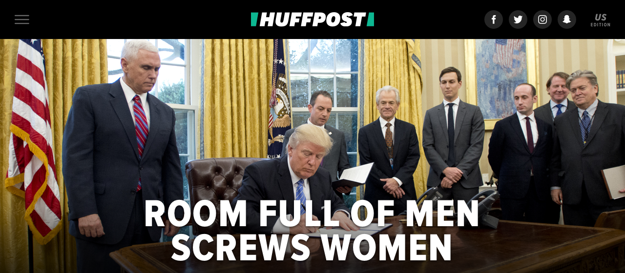
An example of the HuffPost splash. (Photo courtesy HuffPost)
Today’s redesign comes with a mandate from Polgreen to focus HuffPost’s coverage on people around the world who are dispossessed of power, property or privilege and may feel unrepresented in mainstream media. This comes months after Donald Trump stunned the media by winning the presidency and consolidating a devoted base of White working-class voters. Here’s how Polgreen views a story she describes as “a global phenomenon,” one she hopes HuffPost will tell best:
For me, the biggest divide in America, indeed across the globe, is between those who have power and those who don’t, and that doesn’t easily line up with our red and blue, left or right politics. The media has come up short in telling the story of one side of that divide ― of the people experiencing anger, voicelessness and powerlessness.
Some of today’s changes resulted from more practical considerations. The decision to shorten the name to HuffPost, for example, was a consequence of the design team’s desire to make the website name bigger and bolder. “The Huffington Post” had too many characters for that, Beizer said.
But they didn’t want to sacrifice the name in its entirety for branding’s sake, she said. The site’s original logo, with its print-y serif lettering, evokes the site’s founder, Arianna Huffington, and more than a decade of digital journalism. So, they opted for a best-of-both-worlds approach.
“If you think back to when we launched in 2005, we had to borrow some of that newspaper credibility to say, ‘we’re the real deal,” Beizer said. “Our name itself sounds a whole lot like my old paper [The Washington Post]. And it’s 2017. We don’t need that anymore. People know and love our brand.”
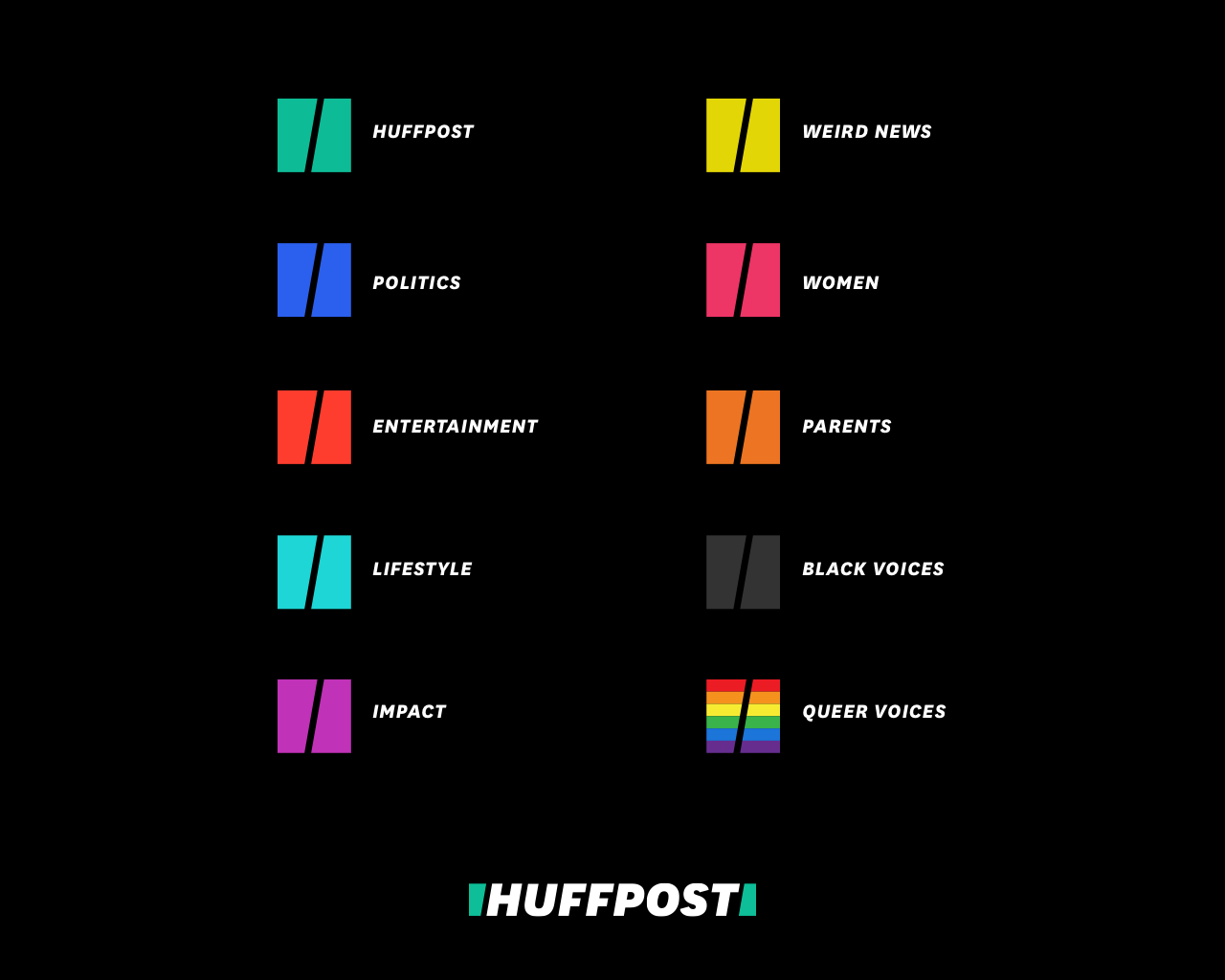
The new social icons for HuffPost’s existing sections. (Photo via HuffPost)
Also new today are redesigned social icons that each correspond to a different section of HuffPost’s website. Working with a New York-based design firm, Work-Order, HuffPost settled on a series of color-coded square boxes bisected by a black slash. The negative space around each slash corresponds to marks that border the outside of each section title. Plus, Beizer said, slashes denote subsections of each website URL — and they look a little like abstract H’s.
An assumption of today’s redesign is that, even in an era of social-driven news discovery, homepages are still valuable. That lines up with site data collected by HuffPost, Beizer said, which shows that users who come to HuffPost’s homepage use it as a jumping-off point to discover new articles; a sizable proportion of readers click on six to 10 different articles on HuffPost after visiting the homepage, she said.
HuffPost’s new homepage is also more modular than its previous incarnation, with articles, ads and features fitting together like puzzle pieces. This was in response to a desire among readers and editors to impose some order on HuffPost’s homepage while still allowing for serendipitous discovery of new content, Beizer said.
“Those people, I expect, will still be well-served by the kind of content we’re putting out there — especially because it’s an organization that will allow them to help find the content they want more easily,” she said.


