Blogs do it, and I like it. Keep it simple, that is.
And now it seems, so does The New York Times online.
The recent launch is not a perfect redesign, whatever that is, but it’s definitely a step in the right direction. It’s as if a layer of smog was peeled off the page revealing a clean, refreshing reading experience.
Simplicity isn’t a new idea. It has been the trend in all types of design for quite some time.
Whether it’s furniture, architecture, software design, interior space planning or graphic design, getting out of the user’s way is critical. How users engage and interact with content or a product determines their level of satisfaction and if they will return .
In general, this redesign raises the bar for the readability of news sites.
Highlights of the redesign
The home page maintains the identity of the previous version but has has done a nice job of cleaning up the navigation on the left rail and enhancing the promotion of multimedia content on the page.
About half way down the page are promos to “Inside nytimes.com” content. They feature a nice use of photos and text and are scrollable, though I didn’t really notice that feature right away.
Bulleted text promos consume the bottom of the page. While they are cleanly presented, this part of the page becomes the “maybe if I have time, but I won’t” section.
Among several new features is a page called “Most Popular,” which highlights the top 10 most e-mailed, blogged, searched and popular movies on the site. It’s a cool feature content-wise but I applaud it for its super-simple design. A similar strategy would seem to work well on the bottom half of the home page as well.
I’m pleased to see that the left rail navigation disappears on section and article pages. Instead, a strip across the top enables you to navigate by section. Sub-navigation clearly points you to the specific area in a section and tells the readers which area they are in.
Plenty of opinion has been written this past week about the redesign, but what do you think? Is this a step in the right direction?
Also, check out these stories:
NYT.com Design Director, Khoi Vinh, on the redesign.
I’m Canceling My Times Subscription, by Jack Shafer
Commentary featured on Newsdesigner.com
The News York Times Redesign Influenced by Blogs
Uncategorized
The New NYTimes.com: Simple = Smart
Tags: Visual Voice, Visuals
More News
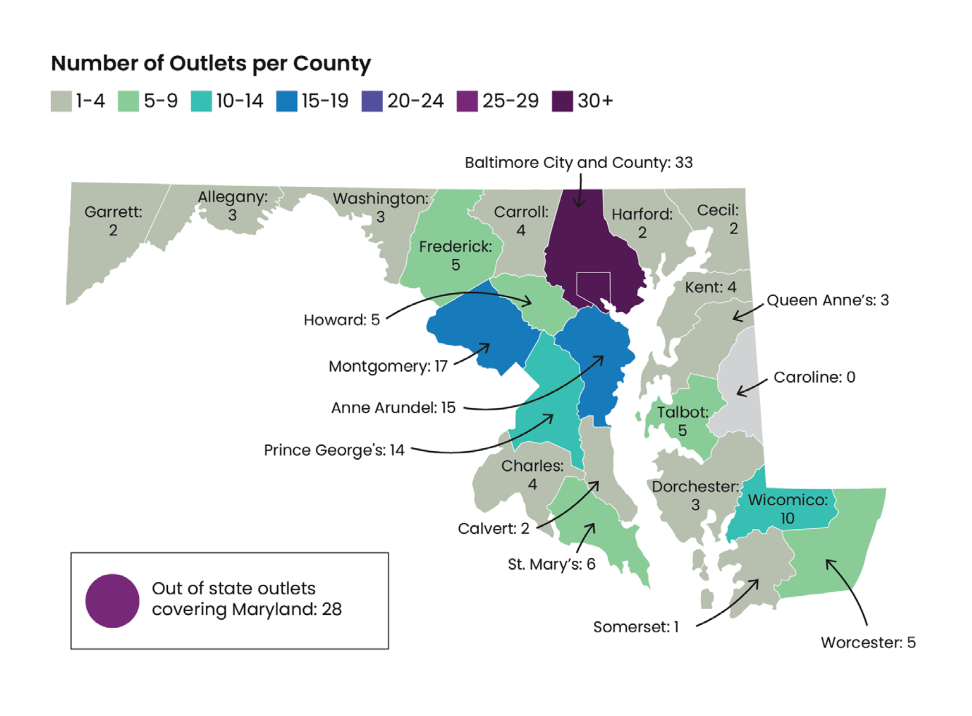
Topography of a news ecosystem: A first-of-its-kind study diagnoses the local news crisis in a single state
Media scholars at the University of Maryland documented the spread of local news dead spots — and unexpected vibrant areas — in that state.
April 19, 2024
$12 million Global Fact Check Fund opens applications for second year of grants
A partnership between Poynter’s International Fact-Checking Network and Google and YouTube continues to support fact-checking initiatives worldwide
April 19, 2024
Opinion | A columnist made a controversial introduction to Caitlin Clark
IndyStar sports columnist Gregg Doyel has been crushed online and accused of being creepy, sexist and worse. He’s since apologized multiple times
April 19, 2024
‘Satanic rituals’ at Taylor Swift shows? That’s false. And experts say the attack isn’t new.
Experts say musicians have been accused of performing satanic rituals for decades
April 19, 2024
How a longtime film critic’s death represents the great dissolve of local film criticism
Bryan VanCampen of The Ithaca Times was an institution in the central New York college town of 32,000. He might have been the last of his kind.
April 18, 2024


