When a stray bullet kills a child, we want to know that bullet’s story. Who fired it, who were they trying to kill, what set did they claim in the city’s neighborhoods, and how could they be so careless as to put a child in harm’s way? But when a car kills a child, we treat it like the weather. These things happen.
In late 2013, Andrea Bernstein, the director of WNYC’s transportation bureau Transportation Nation, decided that had to change. Every year, hundreds of people died from car accidents on the streets of New York City, but their deaths weren’t given the same media attention as the more dramatic, more narratively coherent deaths that resulted from gun violence. Still, their deaths were just as tragic, and if the public knew more about them, it could be aroused to demand that New York City’s government pay as much attention to them as it does to its murders.
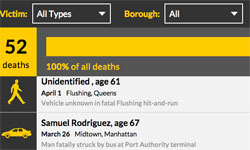
Working with a team of reporters and technical staff, Bernstein created “Mean Streets 2014,” an interactive website that reports the names of each person killed by a car accident, when and where it happened, and the life stories of each victim, either as reported by other media outlets or as researched by the WNYC staff themselves. Just as newspapers around the country have tried to humanize the faces of urban crime, Bernstein and her staff tried to give life to those made lifeless by poor traffic planning and the realities of living near an off-ramp, an overpass, or a street with heavy traffic.
“Part of the motivation was to try to communicate something about the deaths beyond just sort of the ephemeral way that they get reported in newspapers,” says Kat Aaron, a reporter who worked on the project. “Because they’re so frequent, and in some ways when they get treated as a news item without this kind of aggregation, it can sort of diminish the reality of what’s happening in the city.”
Last month, the staff at WNYC handed over the duty of tracking each traffic death to The New York World, a data-driven investigative reporting outlet hosted by the Columbia Journalism School. After fifteen months of drafting the city’s butcher’s bill, Aaron reflects on the what she and her colleagues wanted the public to get out of Mean Streets – and the emotional toll of telling a new story of death every day and a half.
Building the death page
Although the WNYC staff didn’t intend this, their work coincided with the rollout of Mayor Bill de Blasio’s “Vision Zero,” an initiative to end all traffic fatalities in New York by 2025 that includes the installation of hundreds of speed bumps and better street lights at dangerous intersections, as well as implementing a citywide speed limit of 25 miles per hour. As the station’s reporters were building their fatality tracker, they realized that they were also making a tool that could evaluate how the mayor’s initiative was succeeding or failing. “It allowed us to contextualize some of the changes that they were implementing in road design, or speed limits or public awareness campaigns,” Aaron says, “To have this sort of running count as we were talking about these policy changes taking place in the city.”
After launching the web site, WNYC’s reporters fell into an almost-daily routine. In the morning, the New York City Police Department would email reporters a list of the major crimes that happened the day before, including traffic fatalities. Reporters would enter the name of the victim, the age, the date of the death, and the neighborhood and borough where the death occurred, as well as the police precinct and city council district. The staff would report if a death occurred in a hit and run, or if someone was crossing the street, but took care to keep it as straightforward as possible. For example, if you wanted to learn that the driver who killed 15-year-old Jenna Daniels on November 15 had his hands covered in blood from attempting CPR, the Mean Streets site would link to the Gothamist story about the accident, but keep such specific details off the page itself.
“A key thing was just keeping it simple,” Aaron says. “We didn’t do anything too flashy. It’s embeddable, it’s shareable, and it worked as an embed at any size, so it works on mobile, it works on different kinds of platforms, different ways you might be viewing it. … The simplicity was there from the beginning, and it was something that we held to.”

WNYC’s memorial page for traffic deaths in New York City (WNYC)
But the staff made sure to include one key element: a Google Street View image of the street or intersection where the deaths occurred. That way, readers could examine the scene of the crash and think about what the city could do to prevent such a tragedy from happening in the future at that precise spot.
“The thing that we wanted in some ways to focus on was not so much the specifics of the, the sort of potentially grim details of the collision, but also on the intersection where it happened,” Aaron says. “Because that’s something that the city has some degree of control over. So rather than put the focus on the collision itself, it was a way to sort of visually put the emphasis on the street. … To show people that, oh, this is under a highway overpass, or this is under an elevated train track, or this is a really busy street.”
The public policy angle, Aaron says, was always paramount. Even though the station’s reporters were dealing with something as lurid as a car crash, they wanted to keep the project’s priorities focused on how to make navigating the city safer, not to offer a consumer-focused, “news you can use” product. To that end, adds WNYC Data News Unit senior editor John Keefe, they made the Mean Streets site searchable by borough, the age of the victim, and whether the victim was a pedestrian, bicyclist, driver, or passenger – but not by individual intersections, even though such a tool would work perfectly for people standing at a street corner and using their mobile devices to see how dangerous the corner could be.
“The natural instinct is to make a map or make a search tool to locate the deaths near you,” Keefe writes in an email. “And many outlets have focused on the ‘most dangerous intersections’ or have mapped the deaths across the city. We decided against that. Partly because there are more than 12,000 intersections, and that dwarfs the [269] deaths last year. Also we realized that historically, traffic deaths are not usually stories of geography or proximity. They’re individual stories about speed, intersection design, blind spots, traffic flow, alcohol and so much more.”
One final, civic-minded value informing the project, Aaron says, was the scrupulous democratization of the dead. When the WNYC staff reported each death in the tracker, they took care to keep any details that might tug at the reader’s heartstrings out of the story. Inserting any such details might suggest that one death was more tragic than another, and they didn’t want to make that value judgment.
“We fairly intentionally did not sort of seek to highlight any one collision over another, Aaron says. “I mean, we talked to a lot of people who lost loved ones in traffic deaths, and I think I can say with confidence that the suffering of the family members is equal regardless of the circumstances of the crash. So we did not sort of narratively emphasize one collision over another.”
From numbers to stories
But as 2014 wound on, the time came when the staff would have to break this rule. In addition to creating an aggregate picture of how safe the city’s streets are, they wanted to compel their readers to grasp the humanity behind the names and the ages, to realize that a car crash victim’s story didn’t begin and end with his or her death. To focus, Aaron says, not on their deaths, but “who they were when they were alive, and what the city is missing now that they’re gone.”
Last spring, the staff settled on the idea of writing small profiles of each person killed in a traffic accident. They had already spent months routinely entering information about the circumstances of each death into their tracker, and the experience had left them a little spooked; we all walk our cities’ streets creating the illusion that we are mostly in control over how safe we are, but the process of tallying the dead stripped this illusion from the station’s staff. Now, they were returning to the deaths they had previously reported and reliving their tragedies as they reported on their lives.
But how do you stay true to the ideal of treating each death equally while trying to tell the stories of individual lives? Whose lives will you illustrate with a story, and whose will you leave behind as a statistic? Aaron and her fellow reporters decided to at least try to tell the life stories of all 269 people who died in 2014. They contacted family members, teachers, colleagues and employers. They went through the offices of City Councilmembers, contacted funeral homes and asked for contact information, and even walked up to the apartments of the victims’ loved ones, leaving a letter and business card, asking them to contact the station.
By the end of the year, they managed to write the stories of 80 people, which they assembled in a memorial page for the city’s traffic dead. Interviewing so many grieving friends and family members, Aaron says, left a dreadful echo in the hearts of the station’s reporters. “The people definitely sort of haunt you. I’d fall asleep hearing their names reverberating in my mind.”
Still, 80 people is not 269. For all their hard work, WNYC’s reporters just couldn’t meet their goal. If you go to the website’s memorial page, you can learn the story of Anthony Githere, who was run over by a car in East Harlem on May 12, 2014. Githere was born and raised in Nairobi, Kenya, and got his medical degree at the University of Budapest, where he had to learn Hungarian in order to qualify as a doctor. After returning to Kenya, he set up a public health clinic, but his impoverished patients couldn’t keep up with the payments, and he was forced to shut it down. Leaving behind his wife and four children, he moved to New York and began working hospital jobs while trying to qualify to practice medicine in America. But right alongside the story and photograph of Anthony Githere are dozens of grey dots where others’ stories are missing.
“We did our best to tell every person’s story,” Aaron writes in a subsequent email. “In some cases, it just wasn’t possible.”
New reporters, a new approach
In early 2015, the station’s staff decided they couldn’t keep the project going by themselves any longer, and Benjamin Lesser, the editor of The New York World, agreed to carry on the work of cataloguing the city’s traffic deaths. But Lesser and his reporters decided to tweak the tracker a bit. Instead of restricting the tracker to reporting the age of the victim or the borough where the death occurred, the reporters have begun inserting noteworthy details about the victim or the crash. When 60 Minutes veteran Bob Simon died in a car crash, for example, the tracker listed the incident as “CBS correspondent dies in car collision.”
According to Lesser, The New York World’s staff will still give every death the same allotted space and provide the same essential elements about where and when the crash occurred. But they will adopt a slightly more traditional newspaper approach, flagging features of the crash that will capture the public’s attention. “Just like any other news event, you’re going to see what’s relevant, what’s the nut graf,” he says. “While every single one is created with the same respect, you know, different things are going to be important in different instances.”
The New York World is just weeks into this new project, tallying the tragedies, evaluating how Mayor de Blasio’s Vision Zero is progressing — one year in, the city has already seen a dramatic drop in pedestrian deaths — and looking for larger stories to emerge from the data. Along the way, they will stumble across all the moral complexities that arise at the point where aggregated data meet the poignancy of human grief. As his reporters have worked on it, Lesser says, they have already begun feeling the stress of being so close to so many awful moments.
“When we met with [WNYC staff] earlier this year to discuss this possibility, one of the things that they noted was that doing this work can have an emotional toll,” he says, “Looking at these very depressing incidents day after day. Obviously it’s not the only thing that reporters here are doing, not the only thing that reporters at WNYC were doing. But it’s something that’s constantly there, this sort of drip, drip.”
The New York World’s 2015 traffic death tracker follows below.


Comments