Since the beginning of 2015, at least 750 website accessibility lawsuits have been filed in federal court, with at least 432 cases filed in the first eight and a half months of 2017. In August, two New York federal judges said that the Americans with Disabilities Act (ADA) was applicable to websites, following a Florida federal judge’s verdict this past June that ruled that the grocery store Winn-Dixie “violated Title III of the ADA by having a website that was not useable by plaintiff … to download coupons, order prescriptions, and find store locations.” Similar lawsuits have been filed this year against Hobby Lobby, Blick, Five Guys, and eight colleges and universities in the New York City metropolitan area.
This should be worrying news for journalism organizations, many of which have websites that are difficult for screen readers to navigate, particularly with all of the pop-ups and auto-play videos and ads that take up the majority of the page.
I’ve written before about designing experiences for people with visual or mobility impairments, and about efforts that some news organizations are making to create text-only experiences (which is helpful for people who use screen readers) but wanted to revisit the topic based on this flurry of lawsuits, which have resulted in “conflicting rulings” and a “legal grey area,” as the executive director of the Lawsuit Reform Alliance of New York recently put it.
So I reached out to Eric W. Bailey, a former digital designer for The Boston Globe, who currently works as a user experience designer at Cantina. Eric is really passionate about creating accessible and inclusive experiences – he has given presentations on the subject, written about it, created accessible HTML content patterns, and maintains a Twitter feed that often highlights work in the field.
I wanted to know more about what newsrooms could do — and who has already made strides in making their websites more accessible. Our conversation is below.
What kinds of markers do you look for on a website when assessing its accessibility?
POUR experiences, not poor experiences. Accessible websites adhere to four guiding principles, known as POUR. POUR stands for Perceivable, Operable, Understandable, and Robust, and are used to accommodate visual, hearing, motor, and cognitive concerns, the four main types of disabilities. When performing an accessibility audit, I weigh how closely a website’s content, design and code adhere to these conventions.
There is a lot of technical information that determines how successful this is, but at first pass I’ll look for how their main content is presented and structured. Typically, deficiencies at the surface level are a tell for more systemic issues.
For text content, I’ll check to see that it is written using clear language, sectioned using an easy-to-understand hierarchy, and is set to a large enough font size. I’ll also determine if the font size can be adjusted, and if the content is described using semantic code — marking things like paragraphs, lists, headings, links, and buttons with the appropriate HTML tags.
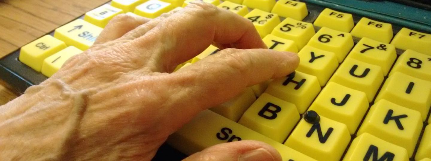
With interactive content, I’ll look for things like alternate ways of interacting with and consuming the information. For example, ensuring that video content has accompanying subtitles and does not contain things like seizure or vertigo triggers.
I’ll also test to see the site can be interacted with via input other than a mouse or trackpad. We live in the age of touchscreens, voice-activated assistants, and augmented reality. The method of controlling these new technologies is not dissimilar to using a screen reader.
Inclusive design
A common misconception is that making a website accessible means only making it work in a screen reader. To paraphrase a quote I like, “Disability is a mismatch between an individual and the environment they're in.”
While screen reader compliance is vital work, there are a wide range of conditions to consider: If your environment is the harsh glare of the sun on your smartphone, the same contrast that’s beneficial for a person with cataracts also assists you. Subtitles not only ensures that an individual with hearing loss can enjoy your new pivot-to-video strategy, but also enables you to consume content on the train ride to work while being polite to your fellow commuters. Everyone experiences cognitive impairment when multitasking — a straightforward design ensures vital concepts can be communicated quickly and effectively.
Are there obvious existing gaps that would be relatively easy for newsrooms to fix? I know this is something a lot of people want to do, but may not know where to begin.
Going through a full accessibility audit can leave an organization overwhelmed as to where to begin — oftentimes to the point of paralysis. There’s a lot of wins you get for free in a typical news site, and I think that’s worth acknowledging.
Most reporters are already adhering to a reading level that is accommodating to a wide range of people. Infographic artists, the unsung heroes of the bullpen, also supplement some stories with charts, graphs and interactives, which aids understanding via recontextualizing the story. Cognitive styles are a complicated, nuanced thing to manage, so it is great to see it being addressed (intentionally or not).
Appearance-wise, a lot of news websites are skeuomorphs, an imitation of a physical newspaper. While it is currently very in vogue in the design community to treat this aesthetic with derision, traditional print newspapers are very good at being easy to read. Mimicking the aesthetic of high contrast of black type on white newsprint, as well as painstakingly crafted, no-nonsense typography carried over to the web satisfies a lot of visual criteria.
All this said, there is still a lot of work to be done.
Authors
Some of the easiest fixes are also some of the most important — you may not even need to be a programmer to address them. Most news site content management systems allow the author to apply hieratical headers, write alternative (alt) descriptions for images, and specify a descriptive page title. Authors can also ensure that links hint at what they will take the reader to, and don’t use ambiguous terms such as, “click here.”
Designers
Designers can stop many potential accessibility issues before a single line of code has been written. Accessible interfaces are easy-to-use, and anything that’s easy-to-use is great design. Most of the designers I know love having constraints to work with — just think of it as another set of rules to push against.
Programmers
For the programmers, there are some low-hanging fruit as well: Templates that use semantic markup are vital. Ensuring the browser can zoom to change the website’s font size enables people experiencing low vision to read its content. Programmatically associating form labels with their inputs ensures that people can do things like easily subscribe to newsletters — I don’t know about you, but I think that’s a pretty important thing for a news organization to have.
Management
Unfortunately, appeals to morality tend to fall on deaf ears until a lawsuit appears. Because of that, I like to treat accessibility work as a value proposition.
In addition to risk aversion, accessible code is robust, stable, and predictable. The confidence that experiences work regardless of circumstance frees up precious newsroom time and resources to pursue other endeavors.
Another consideration is legacy and position in the community and world at large. If news organizations want to maintain being the paper of record in a digital space it means building future-friendly websites.
Consider the return on investment for content that is easy to access and predictable in its formatting versus a one-off special feature. In the race to create the next flashy Snow Fall interactive, it is easy to forget a loyal, aging readership who would benefit from improvements to the entire body of a news site’s published material.
The Catholic Church sex scandal brought to light by the Spotlight team and published on Boston.com was published using Flash. Flash is set to be killed off in 2020. While I am not going to hold such an early web endeavor accountable to modern expectations, I would treat it as a cautionary tale.
The act of making content friendly for assistive technology to interact with also makes it easy for computers to interact with. So all those articles breathlessly describing the potential of technologies such as machine learning and AI? Guess what? An accessible corpus of content stretching as far back as the first entry in your organization’s digital archive makes for some very rich training data.
All these tweaks can compound to make a significant difference. Educating, empowering, and normalizing the practice with your newsroom staff can help turn it from an esoteric practice into an everyday part of the daily job that enriches the experience for all.
Who is doing it well?
News sites push out a great deal of varied content, so compliance can vary greatly. I’m also going to block ads, as they’re highly problematic when it comes to reproducible results — assume any site running them is inaccessible by default.
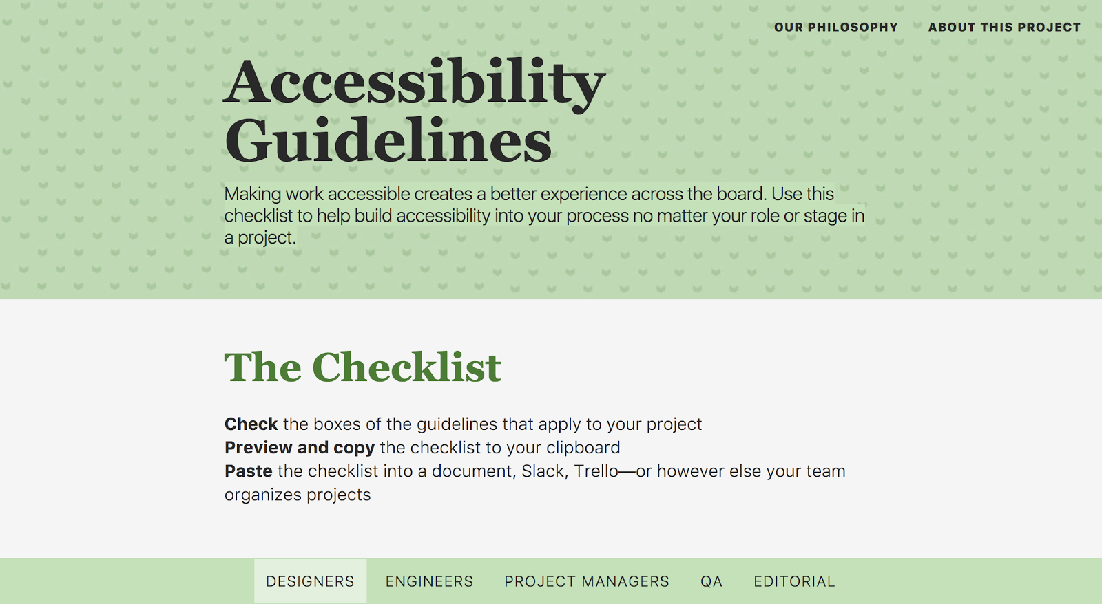
Vox
I’m placing them first by a huge margin. While Vox’s templates could use a little work, the reason for this placement is a very public commitment to a culture of accessibility.
Their Product Accessibility Guidelines include many roles in the newsroom, communicating that it is everyone’s responsibility — I’m especially pleased to see project managers and editorial included. By making their checklist available to all, Vox Product chose to position themselves as a market leader. Anyone modeling their own practice off these guidelines turns it into a competitive advantage.
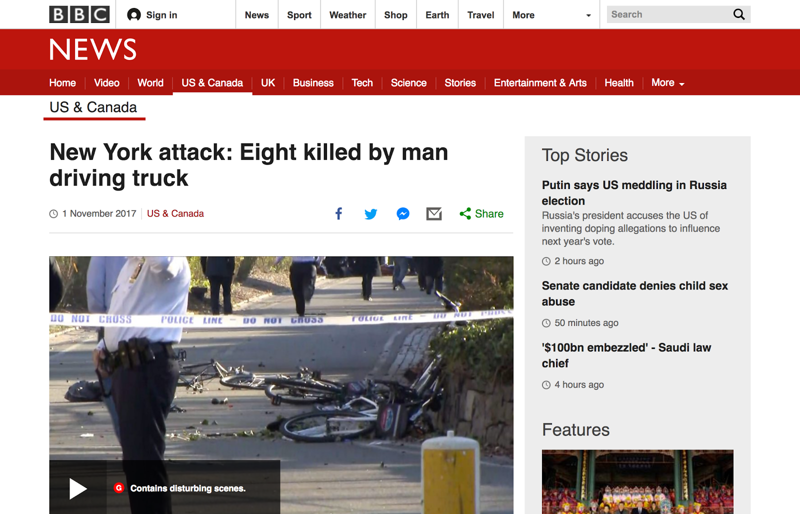
The BBC
I’m going to quote a Facebook post by a friend of mine who lives in Brooklyn: “The state of our news media is so screwed I had to go to the BBC to actually figure out what the hell happened on the West Side today.”
Simple, direct language is so important in our hyperpartisan political climate. Speculation has drifted into so many sources of news that regular, everyday people are having a problem parsing what is true and important.
Many news sites operate assuming they’re the center of the reader’s world, when in fact it’s typically not the case. It’s good business to keep someone subscribed to your ongoing narrative, but this approach ultimately alienates and sacrifices readers.
For individuals not constantly online or as technologically savvy, the approach is overwhelming. For those that do flit from site to site to construct a meaningful narrative, this exhausting chore turns them into a diminishing return.
The BBC does an excellent job staying on point. Articles are short, and written using uncomplicated language. This is excellent for addressing a variety of cognitive styles and conditions, including people learning to read and speak English.
Speaking of English, I’m also a big fan of their Learning English initiative, which includes vocab, highlighting key words and phrases, and video content to supplement the written article (great for individuals with dyslexia, for example). English is really frustrating to learn. It’s full of idioms, shorthand, slang, and borrowed words — even British and American populations struggle with it. It’s an excellent reminder at exactly how conditional a disability can be.
The BBC is also translated into many different languages, which accommodates audiences that don’t speak English as their primary language.Which brings us to my third selection:
The Boston Globe
Some disclosure here: I was a digital designer for The Boston Globe for about two years.
Way back in 2011, the hippies got to steer the Globe’s ship for a bit. The results were revolutionary. The Boston Globe was the first large scale commercial website to adapt itself to whatever device was viewing it. This practice is known as responsive design, and it is now an expectation for every new website to include it.
Responsive design and accessibility are close friends. Their combined philosophies represent a change in the way we perceive and operate the web. It’s no longer thought of as acceptable to wait to go home and finish something at your desk. In fact, desktop computers are starting to become an anachronistic luxury.
The entire world is coming online — cheap smartphones democratize access to the world’s information. This is great for education and destigmatization, say in areas where the accident of birth can render someone a non-person in the eyes of their culture. Responsive design’s commercial success means that this information is open and interoperable, and carries one of the web’s foundational principles forward.
I think making the technology portable and standardized also helped enable some positive normalization. Prior to things like iPhones, a person needing assistive technology might have received an expensive, unintuitive device from their insurance company — provided they were fortunate enough to have insurance.
These devices were often incredibly cumbersome and time-consuming to operate; their near-custom nature effectively making upgrading impossible. Some couldn’t be moved from their installation point easily, meaning that it would force a person using it to stay at home. If they could be moved, hauling them out into public could turn the operator into a spectacle.
Now, someone holding a phone up to their ear to listen to VoiceOver appears no different than someone listening to their favorite song. Features like Switch Control ensure someone can look up a restaurant’s menu in Safari — after they’re done reading its review in the Lifestyle section, of course.
While it unfortunately seems like the current Boston Globe site has slipped with regards to compliance, I feel we owe it a great deal of respect for all it has accomplished.
Newsrooms don't often control other experiences on their pages, like ads. How might they approach this in terms of accessibility?
Ads are, in a word, problematic. Doubly so for news websites.
While this post isn’t about the ugly details of the ad industry, its technology, or its relationship to the news industry, I will say this: accessible experiences are good experiences. The current state of web advertisement does not deliver good experiences.
For everyday display ads, I don’t think newsrooms have a lot of say. The ad industry needs to be better regulated, either internally or via an outside body. Google has already begun to impose its will, for better or worse.
One area where the newsroom does have control is with sponsored content. A concerningly large amount of the population simply does not understand the difference between it and regular news content. In the context of accessibility, cognitive considerations gives great pause for concern.
I would even wax political and say that this weakening of church and state — the understanding that the newsroom and business side of a news organization are separate — has led to other, unintended accessibility-related consequences.
What are ways newsrooms might be able to test before they build? After?
While I’m confident that printed papers will still be around long after I’m gone, news organizations need to accept the fact that the web is here to stay.
The three big things I’d like to see more newsrooms do are hold vendors accountable, test with actual people, and empower their internal teams. It represents a change in perception, where the organization is no longer a local monopoly and is instead one choice in many.
Many vendors out there prey on news organizations, promising the world but failing to deliver. Vendor solutions that are plug-and-play circumvent a traditional build process, and therefore can slip in without being audited. When it comes to accessibility, inquiring about their VPAT is a quick way to see if it is even a basic consideration.
It might be wishful thinking on my part, but if every news organization demands compliance, the market will have to respond. Reversing this phenomenon of learned helplessness may also help some other problems the industry is facing.
Testing with the actual people who use your product takes concepts out of the theoretical and reveals actual usability issues. While these surfaced problems might damage some egos in the short-term, it neatly sidesteps the sunk cost fallacy by revealing points of friction before significant effort has been expended. You want to make sure to test early on, using a diverse range of people — including people with disabilities — in different usage modes and contexts (desktop, mobile, casually browsing, hunting for info, sitting, on the go, relaxed, in crisis, etc.).
Stakeholders and product owners may not be familiar with the importance and benefits of accessibility. However, there are probably people in your organization who already have interest and experience with the practice. Allowing them to pursue this interest will open up opportunities for things such as a living styleguide and automated testing tools to enter into a product roadmap. These two practices can go a long way to testing and delivering an inclusive, accessible experience for all.